Designing A Studio Apartment: 3 Tips And 25 Ideas

desinging a studio apartment 3 tips and 25 ideas

Designing a studio apartment is a tricky thing: you do smart zoning so that every space was separated, at least visually but the whole apartment looked unified and chic as the parts are flowing into each other. Let’s consider some tips for designing such a dwelling and have a look at examples.

Choose A Single Color Scheme

Don’t choose too complicated colors schemes with lots of prints tend to make your home look too busy and consequently, too small, and we don’t need it. Besides, too many colors and prints will be difficult to match in different zones.  Forget it and go for simple color scheme with 2-3 colors to tie your entire studio together and achieved a stylish and airy unified look.
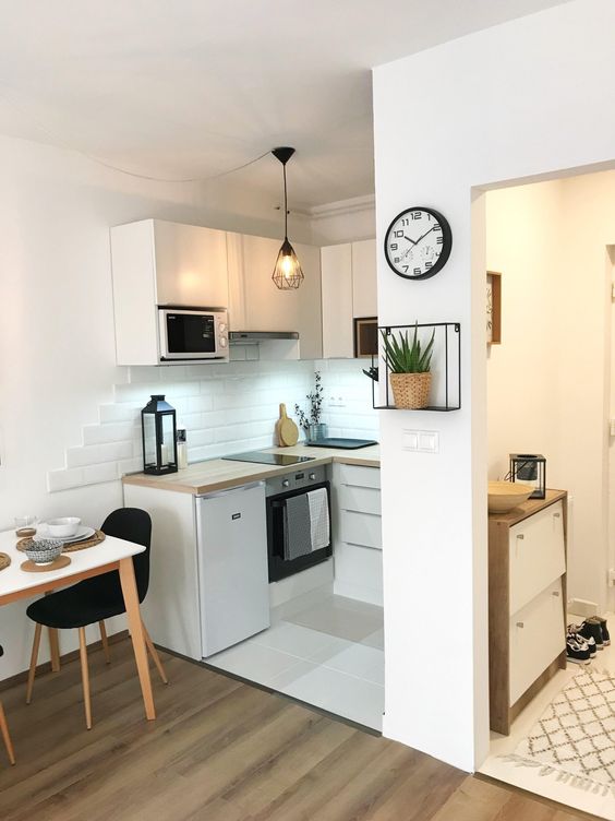
A very small studio apartment done in white and touches of light-colored natural wood.
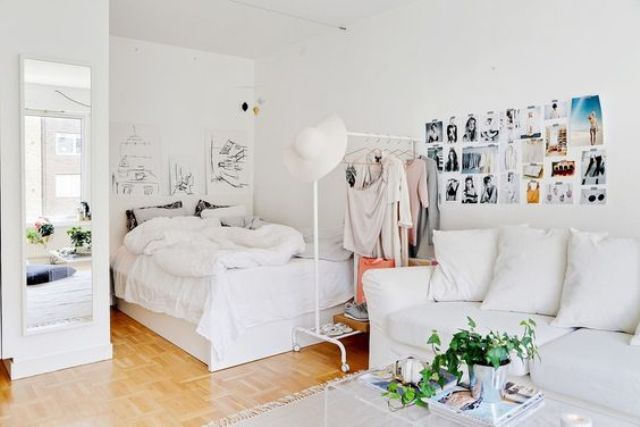
A very small studio apartment done in white and touches of light-colored natural wood.

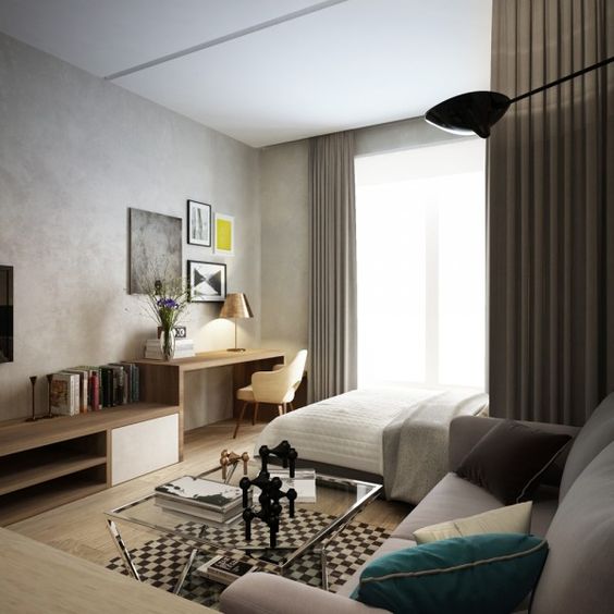
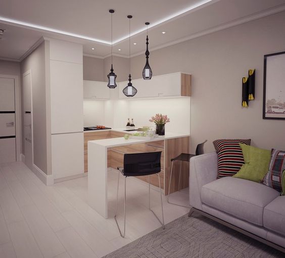
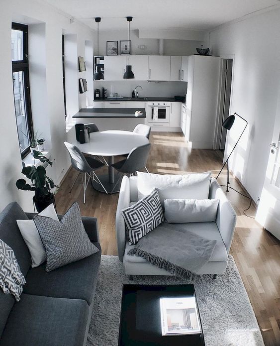
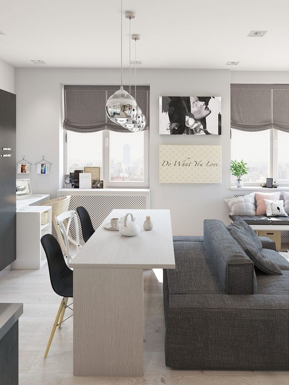
A small studio apartment done in the shades of grey and off-white for a modern feel.

A small studio apartment done in the shades of grey and off-white for a modern feel.

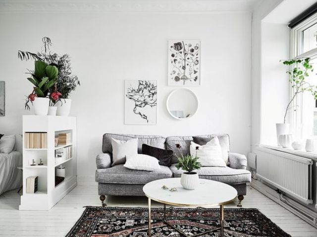
White is the most universal color for any space and it makes it look bigger, so choosing it is a win-win idea.

White is the most universal color for any space and it makes it look bigger, so choosing it is a win-win idea.

The studio done in the shades of grey with a couple of neon yellow accents.

The studio done in the shades of grey with a couple of neon yellow accents.

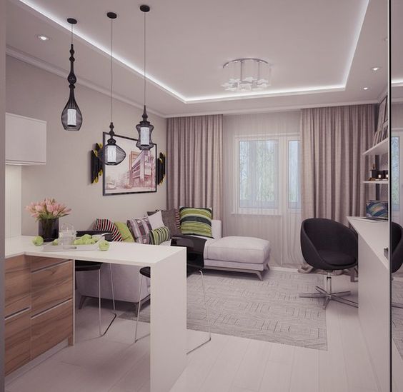
A small modern dpace done in white, blush and with touches of neon green.

A small modern dpace done in white, blush and with touches of neon green.

If it's a Scandinavian space, the main color will be white and may be grey.

If it's a Scandinavian space, the main color will be white and may be grey.

Soft earthy tones of beige and brown are complemented with greys for a cozy feel.

Soft earthy tones of beige and brown are complemented with greys for a cozy feel.

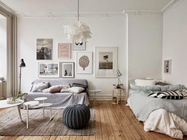
A dreamy studio space done in very light pastels - pink, green and grey.

A dreamy studio space done in very light pastels - pink, green and grey.

Black and white are the main colors in this space and dusty blue is added.

Black and white are the main colors in this space and dusty blue is added.

White and off-white colors are right what you need for a very small dwelling to feel larger.

White and off-white colors are right what you need for a very small dwelling to feel larger.

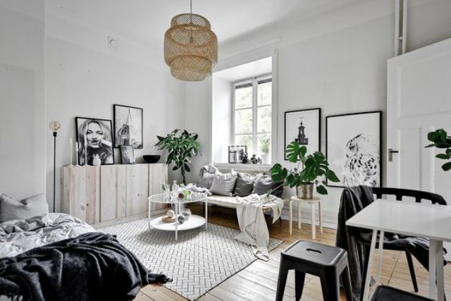
A Scandinavian apartment done in black and white for a timeless and stylish look.

A Scandinavian apartment done in black and white for a timeless and stylish look.

Divide Wisely

Zoning or dividing your space is essential in any layout and a studio is no exception. First of all, separate your sleeping space somehow, even if you think that it’s not necessary after some time you’ll come to it. Your sleeping zone is the most private one in the layout, so keep it private adding some space divider – it may be even a glass one but still it’s a must. Think of zoning the rest of the space too, you may not add space dividers but just visually, it’s a great idea that won’t make your space feel smaller. A well-placed sofa or dresser is all you need to visually divide the spaces – so easily!
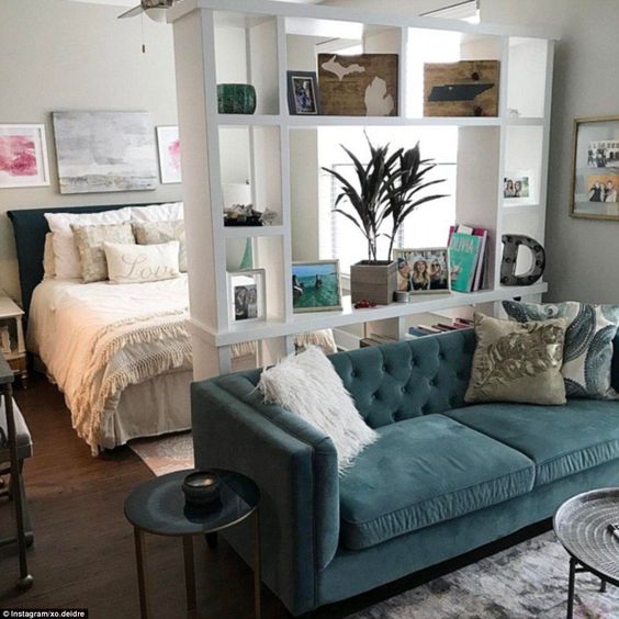
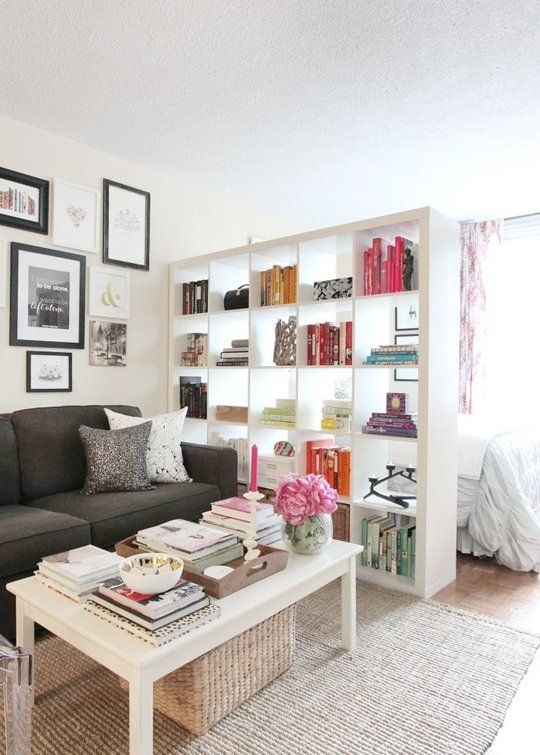
A strategically placed sofa and bookshelf separate the sleeping zone from the rest of the space.

A strategically placed sofa and bookshelf separate the sleeping zone from the rest of the space.

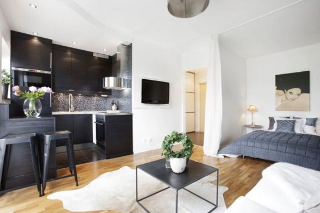
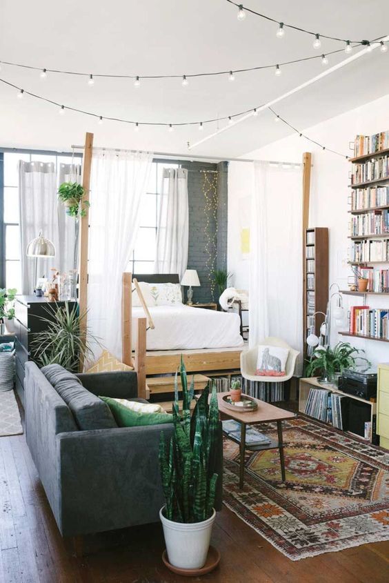
Light and airy curtains on one side and a dresser on another side to separate the bed space.

Light and airy curtains on one side and a dresser on another side to separate the bed space.

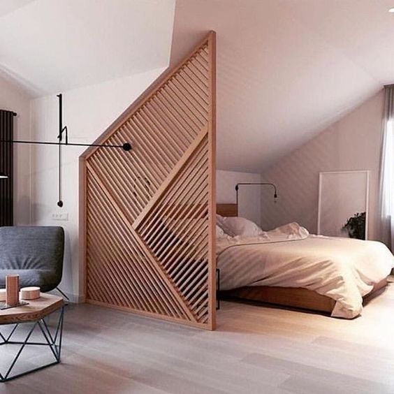
A creative geometric plywood space divider that perfectly fits the space and highlights the attic roof.
A creative geometric plywood space divider that perfectly fits the space and highlights the attic roof.

Visual space separation is done with strategical placement of furniture.

Visual space separation is done with strategical placement of furniture.

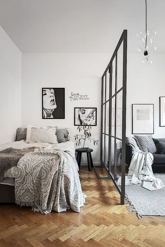
A framed glass partitition is a chic idea that still lets light inside and makes the space airy.

A framed glass partitition is a chic idea that still lets light inside and makes the space airy.

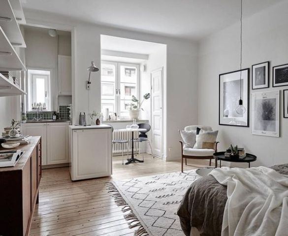
A small kitchen nook, a window niche with a dining set and a sitting zone by the wall.

A small kitchen nook, a window niche with a dining set and a sitting zone by the wall.

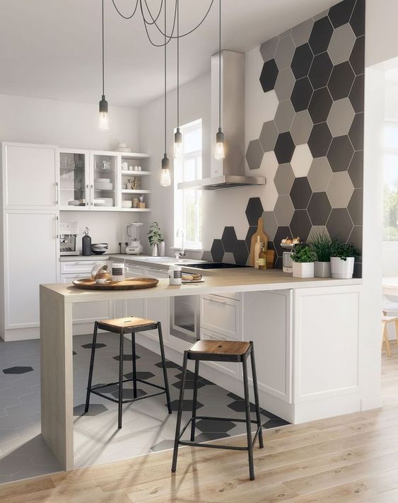
A kitchen island and breakfast table separates the kitchen zone from the rest of the space.

A kitchen island and breakfast table separates the kitchen zone from the rest of the space.

The zoning is done with a large bookshelf, it doesn't look bulky and doesn't prevent light incoming.

The zoning is done with a large bookshelf, it doesn't look bulky and doesn't prevent light incoming.

The spaces are seprated with a sofa and a console table placed in a smart way.

The spaces are seprated with a sofa and a console table placed in a smart way.

Create Visual Height

When dealing with a small footprint space, visual height is exactly what you need to make it look harmonious and not that small. While looking upward, you’ll see the home as a whole and not just as a small space, and there are several ways to do that. Vertical shelving units, space dividers, vertical mirrors are right what you need to add a bit of height to your home. Yes, your space dividers and smart placed vertical shelves will not only separate the space but also make it look higher.
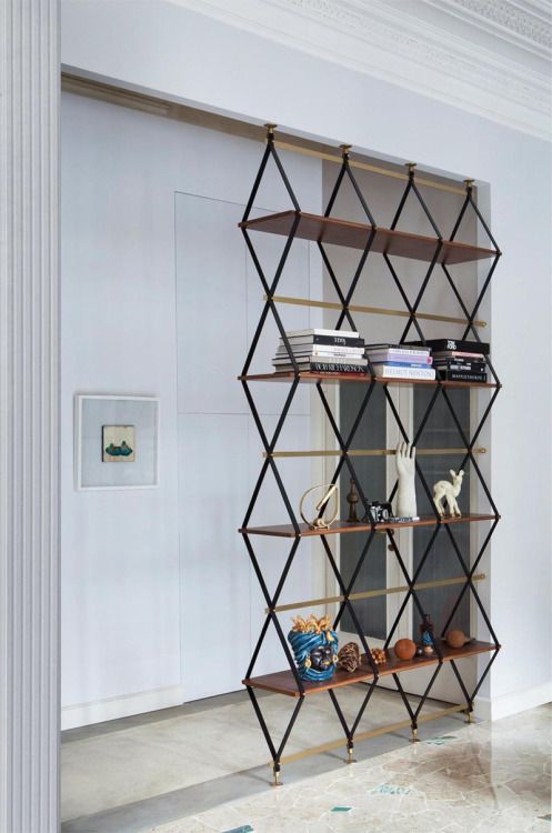
Such a vertical shelving unit is a great piece to rock in any space, it will add height and divide the spaces.
Such a vertical shelving unit is a great piece to rock in any space, it will add height and divide the spaces.

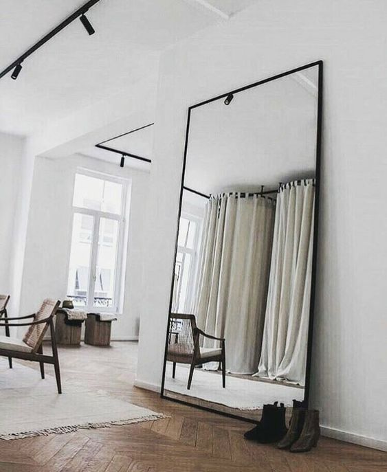
An oversized vertical floor mirror will add visual height, can be used for dressing up and will visually enlarge the space.
An oversized vertical floor mirror will add visual height, can be used for dressing up and will visually enlarge the space.

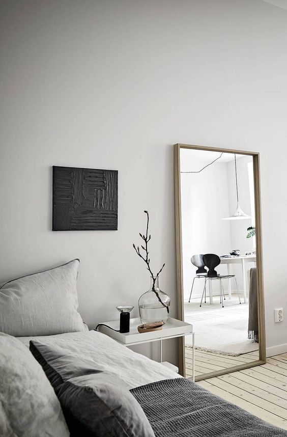
A simple vertical mirror in a wooden frame is always a good idea and it will fulfill many functions.
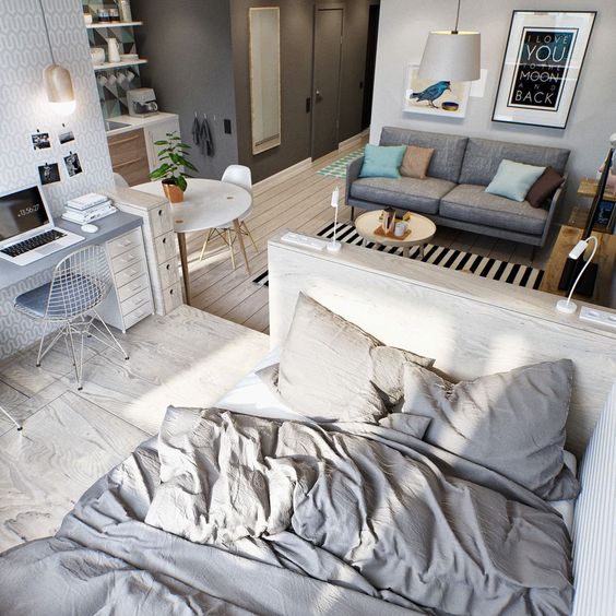
A simple vertical mirror in a wooden frame is always a good idea and it will fulfill many functions.
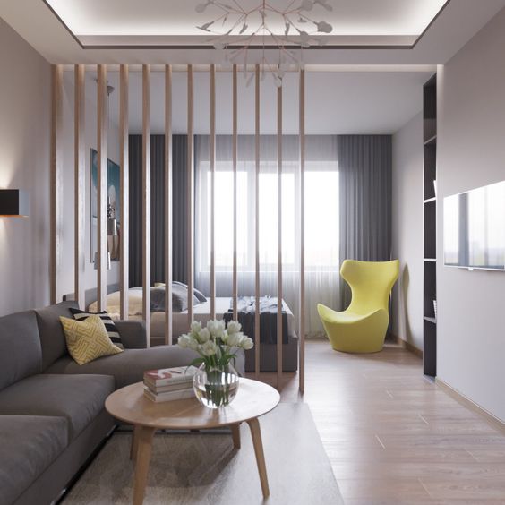
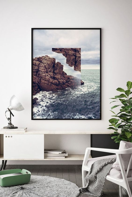
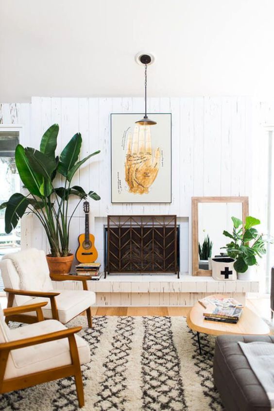
A vertical wall art will also add height, interest and will make the space more stylish.

A vertical wall art will also add height, interest and will make the space more stylish.

A vertical wall art and mirror are used both to make the space more visually whole.

A vertical wall art and mirror are used both to make the space more visually whole.