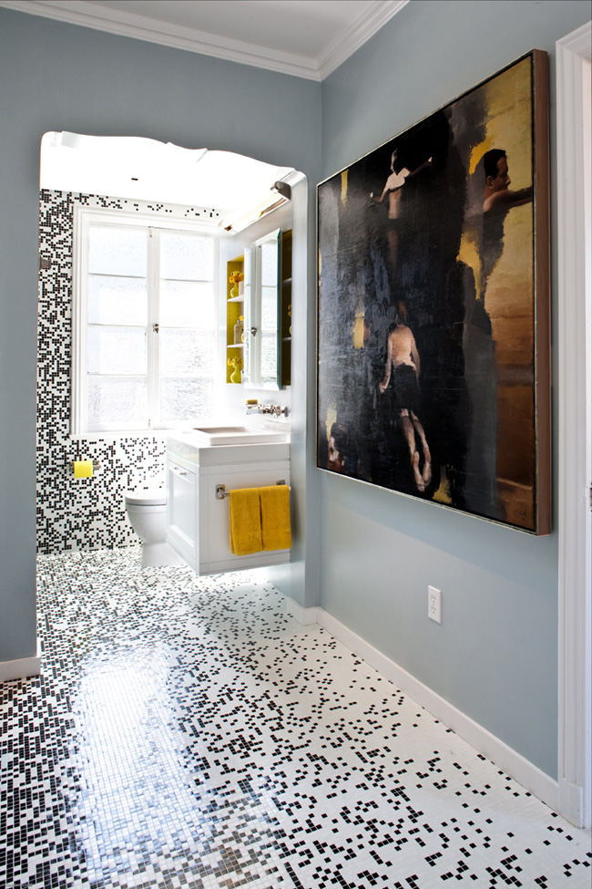
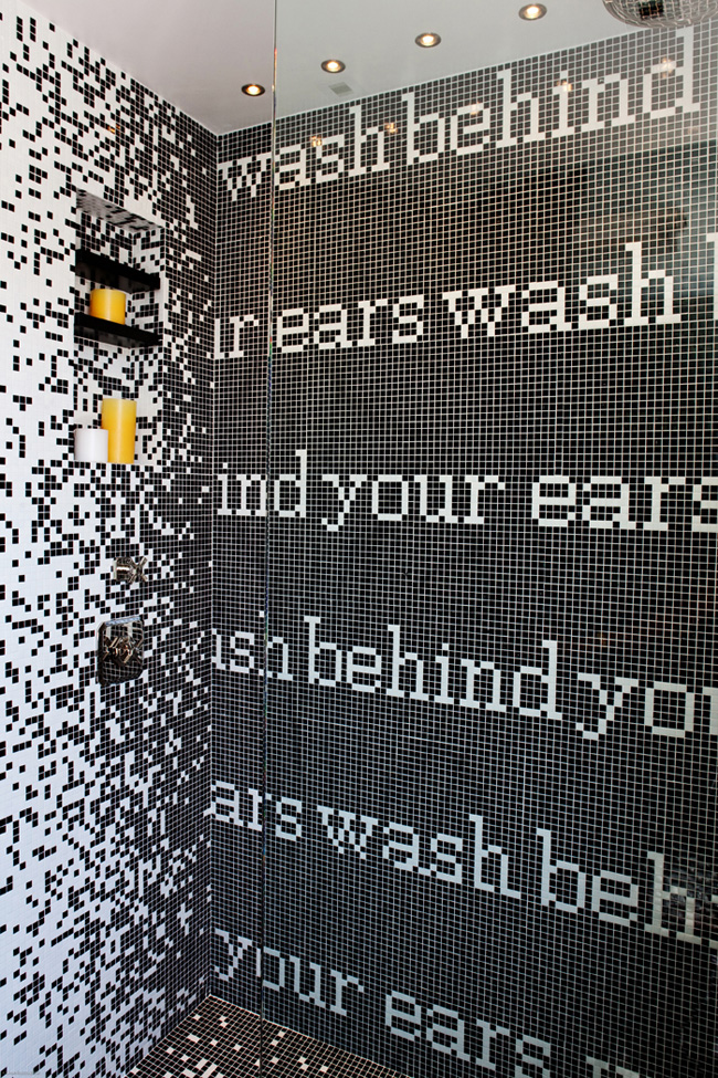
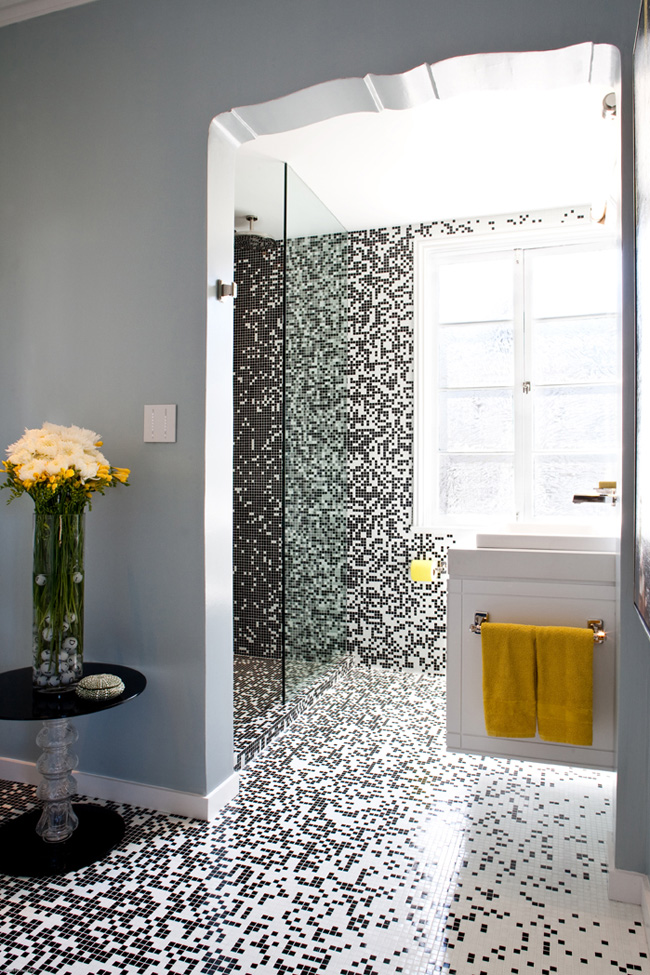
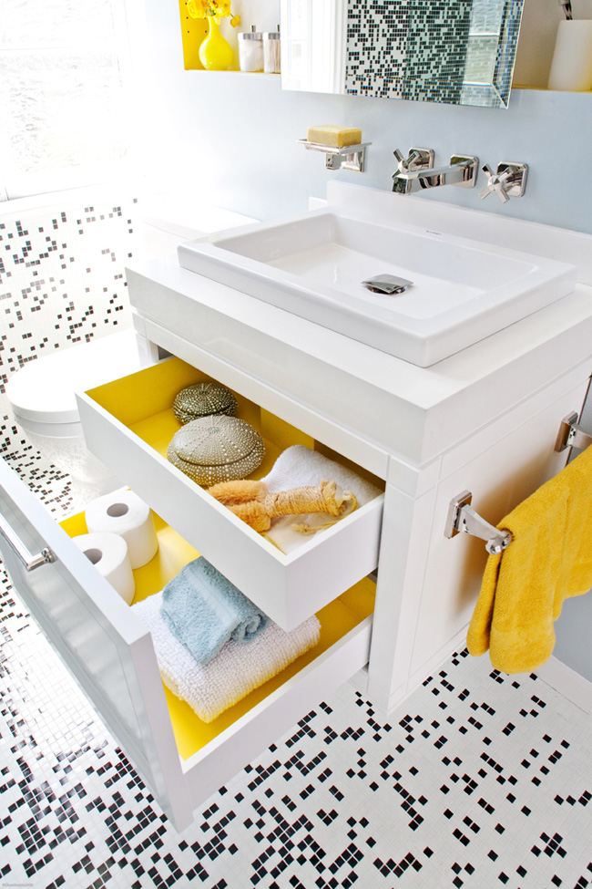
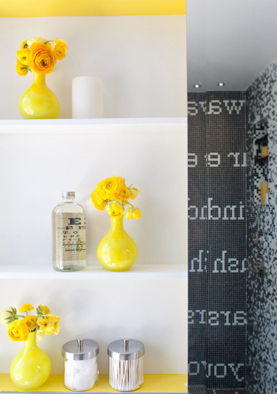
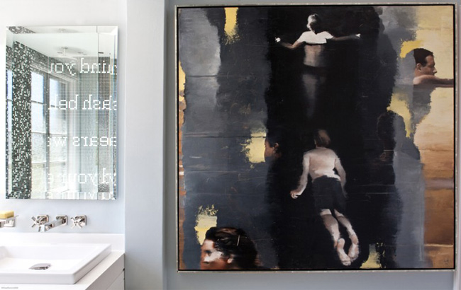
We all know that with mosaic tiles we could created very beautiful wall design in bathrooms and kitchens. Although usually only simple patterns come in mind. De Meza + Architecture+ Interiors created much more interesting bathroom design for 2010 San Francisco Decorator Showcase. Pixilated walls that they created with black and white mosaic tiles looks more like an artwork than a simple pattern. In order to create this really complicated pattern Spec Ceramics created 12” x 12” mesh sheets with tiles that was much more easy to install later.
The back wall of the shower, draws inspiration from a photo of a French staircase that used tiled words on the risers. The floor and adjacent wall pattern was designed to create movement in the space and to also draw attention to the back wall of the shower. In the result, designers have got a modern design that live within a traditional envelope. Check out a more detailed description at HomeWorkshop.
{ Photographs by Shae Rocco }
