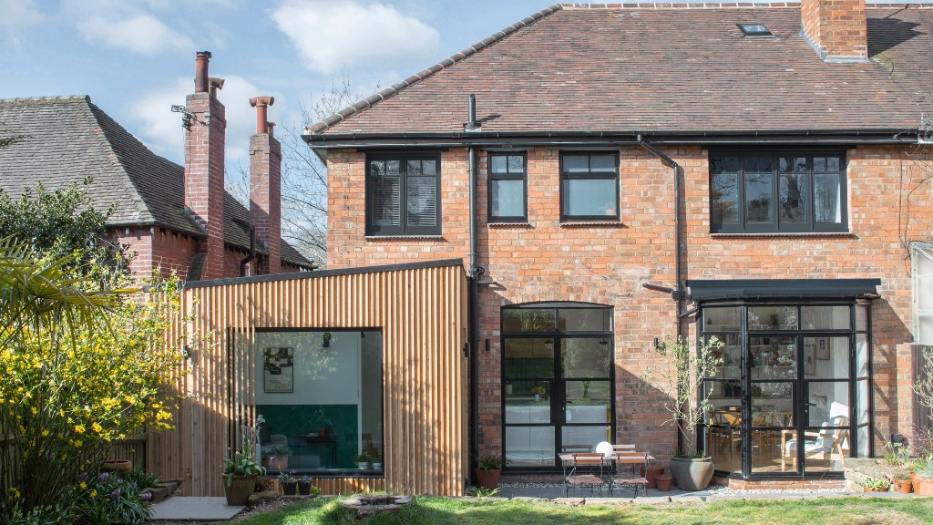
This garden room is an extension to a traditional home in Birmingham, and it's modern and light-filled.
This home is a cedar clad extension for a semi-detached house in Birmingham, it was built and furnished by Intervention Architecture for an illustrator and got its name – Illustrator’s Botanical House.
The team opened up the living spaces as much as possible. Light enters from the north-east facing garden and the additional room has a stronger collection with the greenery outside. At the rear of the home, a large living, kitchen and dining space fills the entire width of the site, leading into the protruding extension with a sliding door. Above, the more private first floor houses a bedroom and bathroom spaces, accessed via a staircase at the center of the home.
The expanded living areas all spill out onto a paved limestone patio through a large openable bay window and an adjacent set of doors. The original timber frames of these were replaced with black, Crittall-style aluminium frames, bringing a slightly industrial feel to the home’s lower level. White Formica plywood, concrete worktops and natural wood finishes are used throughout the living, kitchen and dining area, creating a contrast with the slightly rougher garden room which is accented by a bold green band around the lower half of the walls.
Within the garden room, to further emphasize the inside/outside space, they used reclaimed honed terracotta hexagon tiles to add warmth and a rough texture within the interstitial area of the house preceding the limestone paving slabs. This use of green highlights continues into the main bathroom, which has aquamarine tiles. Black light fittings in the bathroom echo the black window frames.
A short hallway leads from the front of the house into these new, open spaces, where the interior flooring materials were chosen to provide a sense of continuity. For the flooring, the team proposed a contemporary longer format of herringbone oak boards for the main space, to tie in with the smaller existing herringbone blocks found in the house hallway.
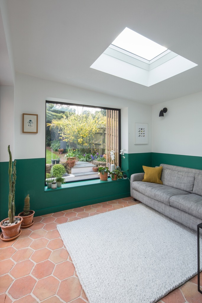
The living room features colo color blocking - an emerald and white wall and it is filled with light through a window and a skylight.
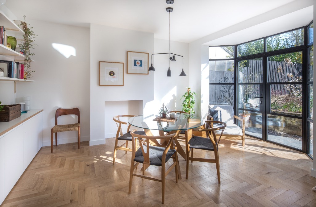
The kitchen and dining space are also filled with light due to a glazed wall, there's stylish furniture and chic lamps.
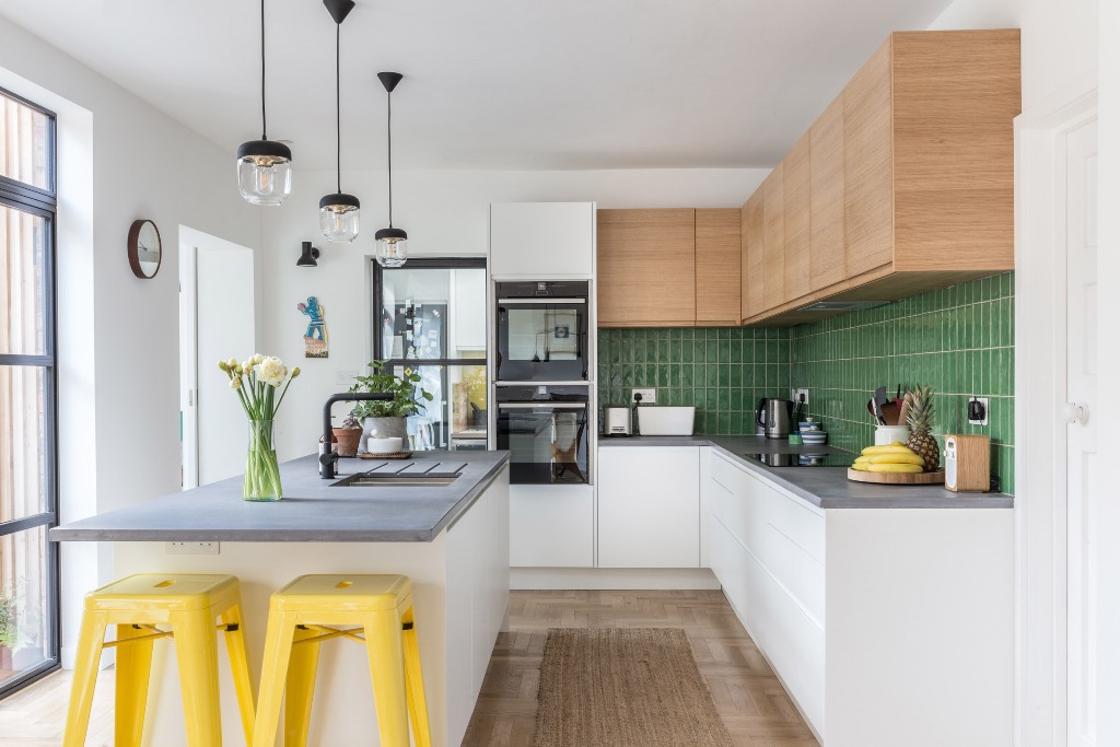
The kitchen is done with sleek cabinets and a green tile backsplash, a kitchen island with a concrete countertop and bright yellow stools.
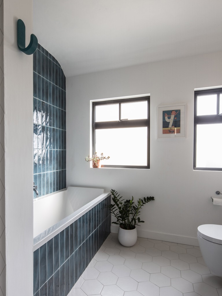
the bathroom is clad with teal tiles on the wall and hexagon ones on the floor and features windows.