3 Color Mistakes In Decor And 22 Ways To Fix Them

color mistakes in decor and 22 ways to fix them

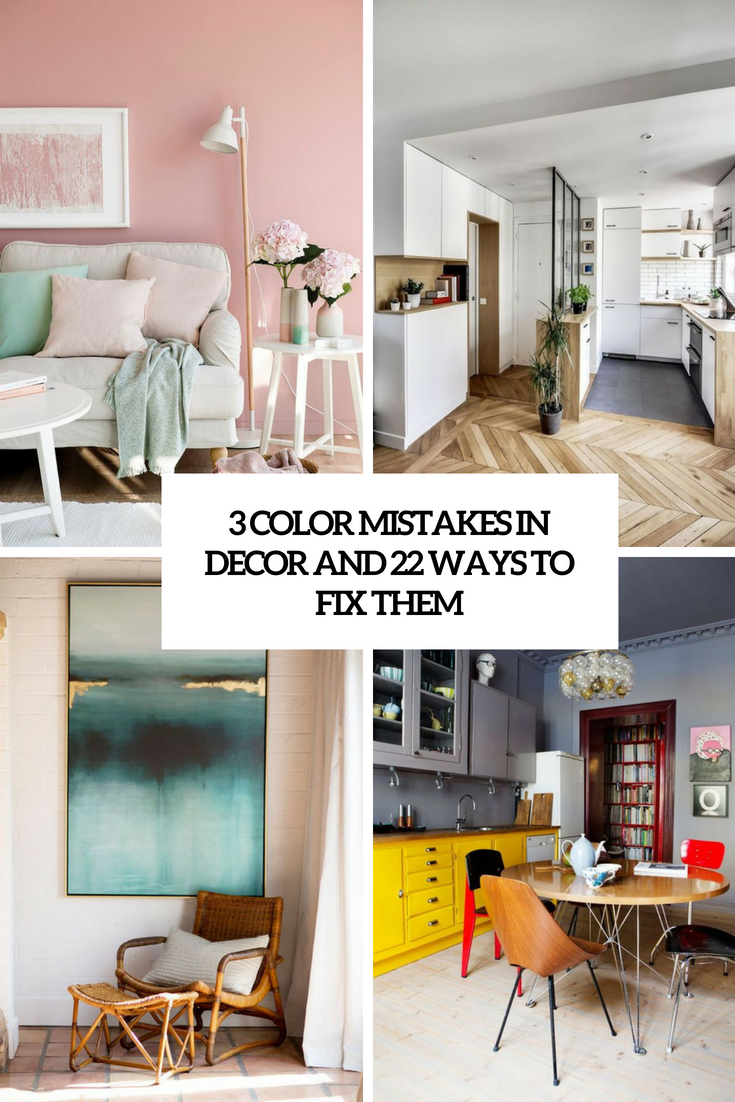
There are so many colors and shades that it’s not surprising that we sometimes make mistakes while decorating our dwellings. That’s why today we’ve gathered three most common color mistakes that people make and we’ll tell you how to avoid or fix them easily. If you follow this advice, your home will look better and the rooms will be in perfect harmony with each other.

No Balance

When dealing with several colors in one room, you should find a perfect balance. There should be neutrals for your eyes to rest and bold colors to stand out and create accents. If you have too much of bold, it will be overstimulating, and if you go for too many neutrals, the result will be boring. Luckily, there’s a great trick to help you, the famous 10/30/60 rule.

This is a way to combine three colors in the interior decor, and they won’t look excessive, they will be interesting and organic. This rule dictates what percentage of the room should be taken up by each shade in your color scheme. The first 60% is your base color and usually a neutral shade. The next 30% is your secondary color, or a middle ground, and the final 10% is your accent color, which is the boldest shade. If you wanna know more of applying this rule and see some examples, head over here.
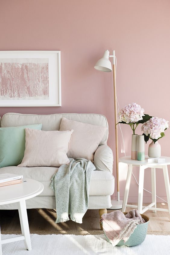
A pastel living room with much neutrals, pink and some mint-colored accents.
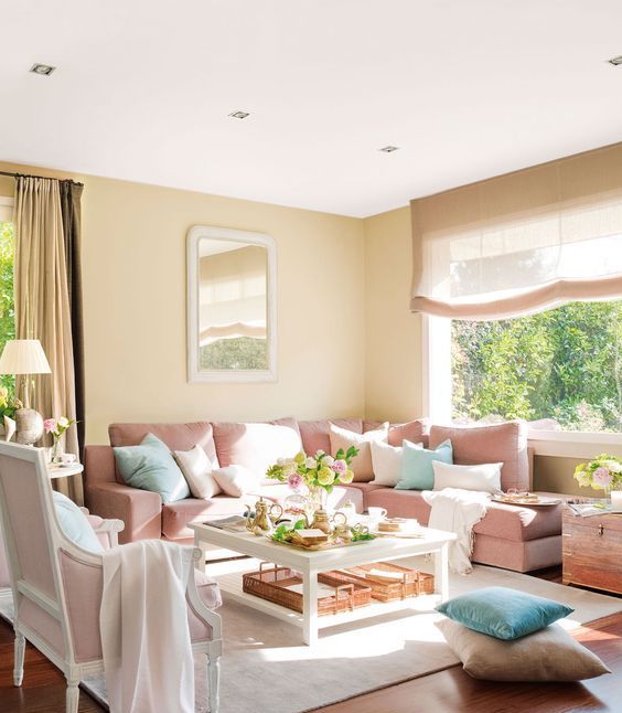
A pastel living room with much neutrals, pink and some mint-colored accents.

A neutral living room done with mint and coral accents will never fail.

A neutral living room done with mint and coral accents will never fail.

Creamy as the main color, navy as the secondary and turquoise for colorful accents.

Creamy as the main color, navy as the secondary and turquoise for colorful accents.

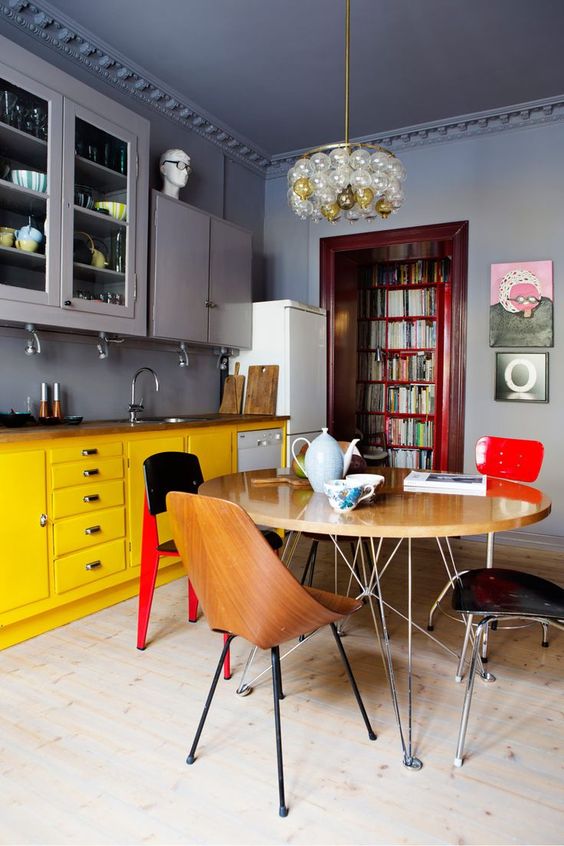
A moody space done in grey, with yellow as the secondary color and red for bold accents.

A moody space done in grey, with yellow as the secondary color and red for bold accents.

A cozy living room with tan as the main color, light pink as a secondary and pure white for refreshing.

A cozy living room with tan as the main color, light pink as a secondary and pure white for refreshing.

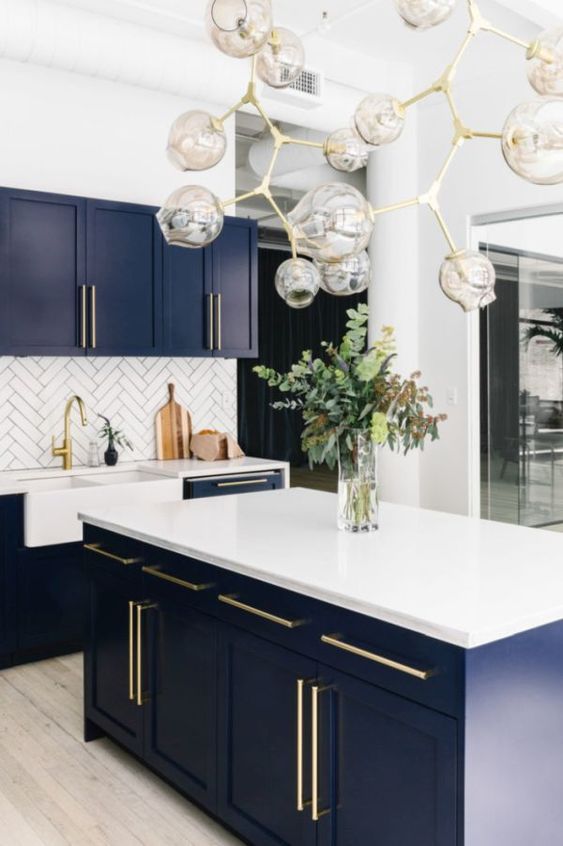
A chic kitchen in white, navy as a secondary color and gold for elegant touches.

A chic kitchen in white, navy as a secondary color and gold for elegant touches.

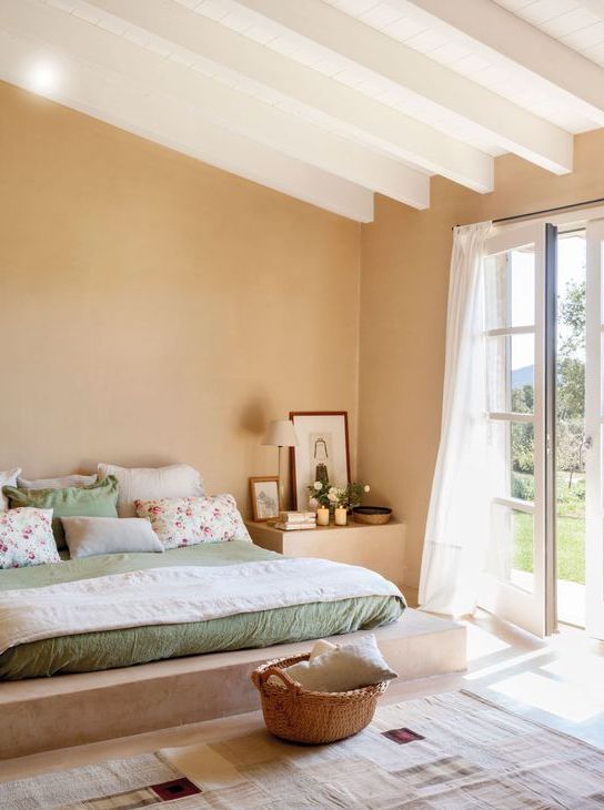
A chic bedroom with white as the main color, tan as a secondary and sage green for soft accenting.

A chic bedroom with white as the main color, tan as a secondary and sage green for soft accenting.

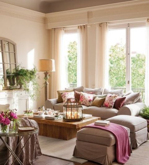
Soft beige as the main color, light brown as a secondary and dusty pink for an accent.

Soft beige as the main color, light brown as a secondary and dusty pink for an accent.

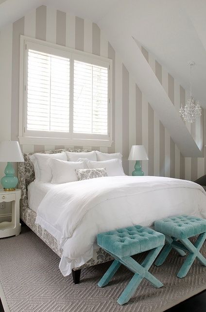
An attic bedroom in white, grey as a secondary color and touches of turquoise here and there.

An attic bedroom in white, grey as a secondary color and touches of turquoise here and there.

Designing Every Space Separately

Yes, every space of your home has a different use but decorating them all too differently is a bad idea. Every professional designer thinks of a home as one cohesive unit and work the design with unity in mind. Do the same!

Every space of your home should have a similar color palette, so they all flow together seamlessly. Make sure that every room of your home works in harmony with the ones adjacent to it. If you are ready for that, go for a single color palette for the whole home and similar items – this is pure harmony!

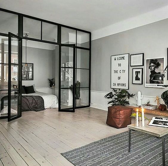
A living room and bedroom separated with a glass wall look as a stylish unity.

A living room and bedroom separated with a glass wall look as a stylish unity.

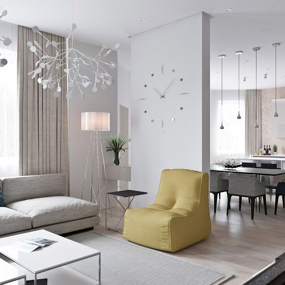
The spaces are connected with the same colors but accented differently - in yellow or black.

The spaces are connected with the same colors but accented differently - in yellow or black.

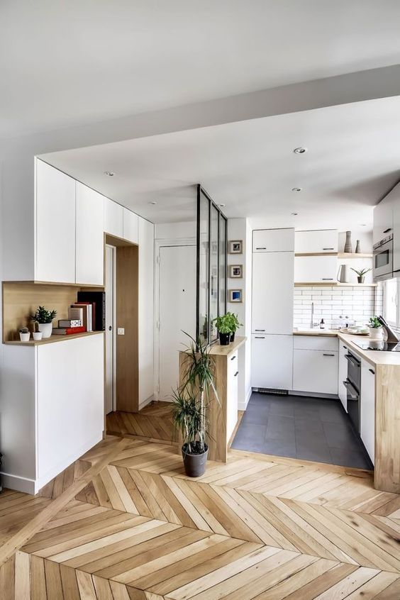
The kitchen and entryway seamleslly flow into each other thanks to the same colors and materials.

The kitchen and entryway seamleslly flow into each other thanks to the same colors and materials.

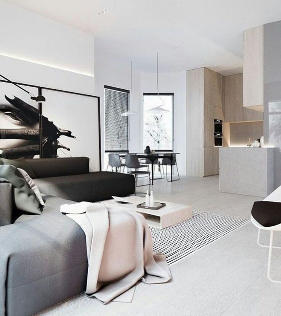
The same color palette and touches of blush and cream make the open layout harmonious.

The same color palette and touches of blush and cream make the open layout harmonious.

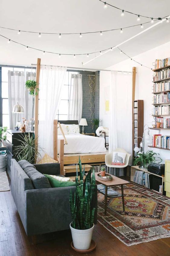
The boho space designed as a unity in the same colors and with similar accents.

The boho space designed as a unity in the same colors and with similar accents.

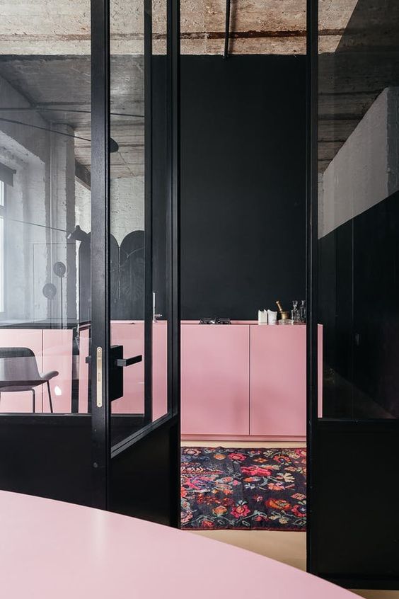
The spaces are done in the same colors - black and pink and look like one.

The spaces are done in the same colors - black and pink and look like one.

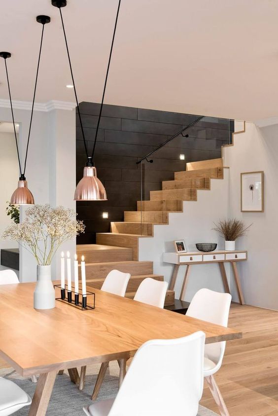
The dining room and entryway look as a cohesion and a ladder adds color to the space.

The dining room and entryway look as a cohesion and a ladder adds color to the space.

No Contrast

If you go for too much similar and same, your home can become matchy-matchy, which is often boring. Such a mistake is easy to fix: simply add some contrast to give the room a little more visual interest. Try adding an eye-catching accent color through the room’s accessories or throw a bold print or pattern into the mix. It’s very easy and won’t require much investment or time. Make your home a better place to live!
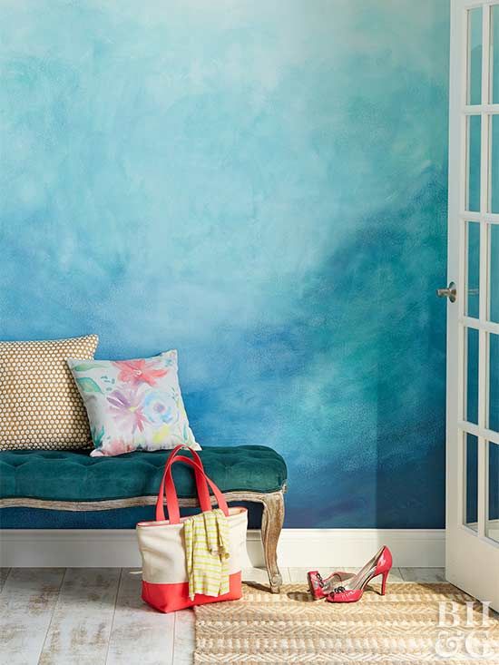
Add a watercolor painted wall as a colorful accent to any space, it's an easy DIY project.
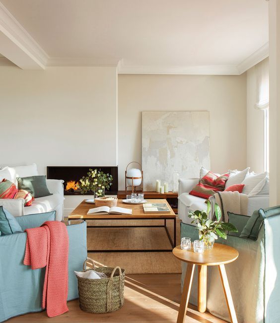
Add a watercolor painted wall as a colorful accent to any space, it's an easy DIY project.
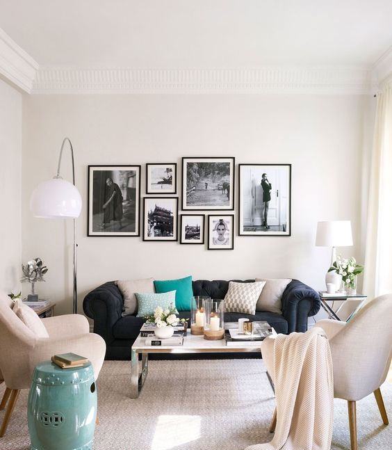
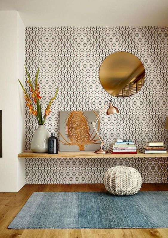
A dyed rug in the shades of blue is a simple way to add color to the space.

A dyed rug in the shades of blue is a simple way to add color to the space.

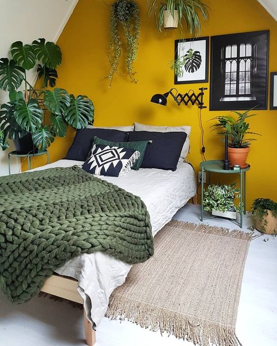
A mustard-colored accent wall is a nice idea to add color to the space and highlight it.

A mustard-colored accent wall is a nice idea to add color to the space and highlight it.

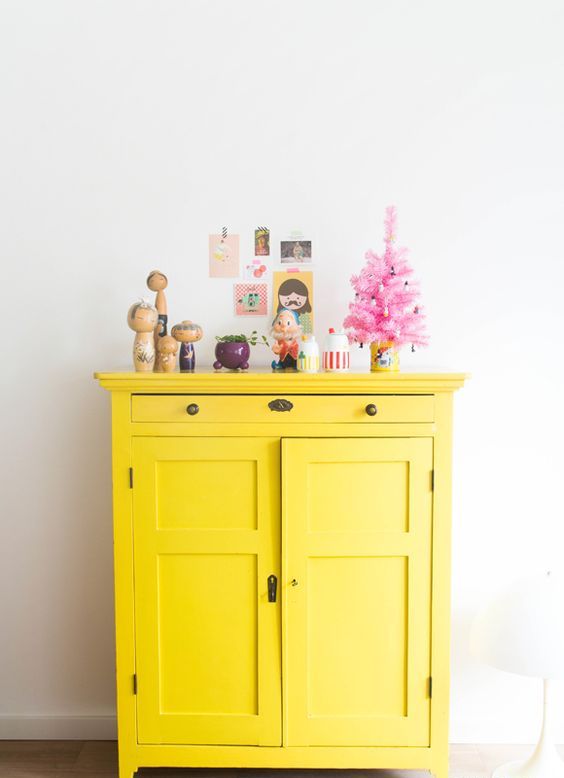
A bright yellow cabinet is a nice idea to add color and make an accent.

A bright yellow cabinet is a nice idea to add color and make an accent.

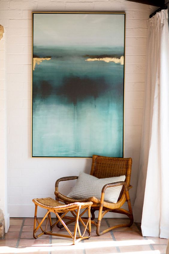
A bold and deep-colored artwork is a great way to make an accent and spruce up the space.

A bold and deep-colored artwork is a great way to make an accent and spruce up the space.

Accent the fireplace with coral paint over it, this way you'll highlight it.

Accent the fireplace with coral paint over it, this way you'll highlight it.