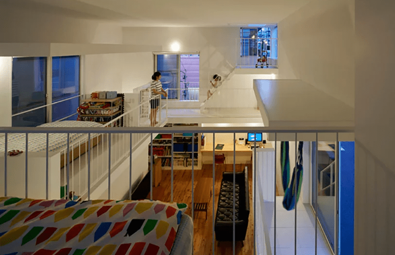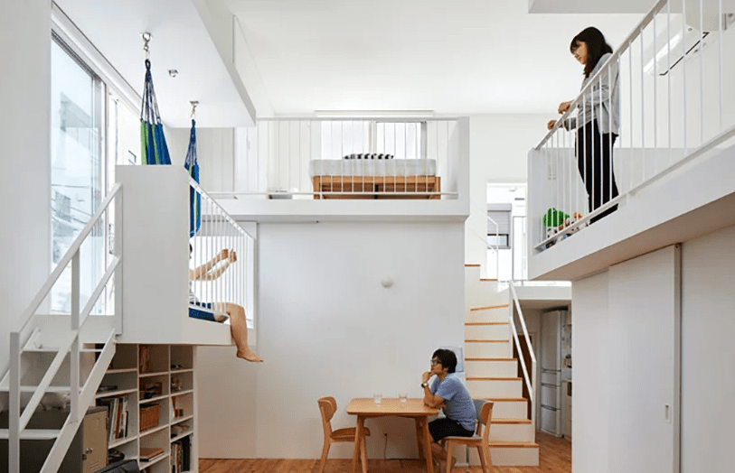
This ultra-minimalist home in Japan features interesting splitting into levels and sublevels with inner balconies.
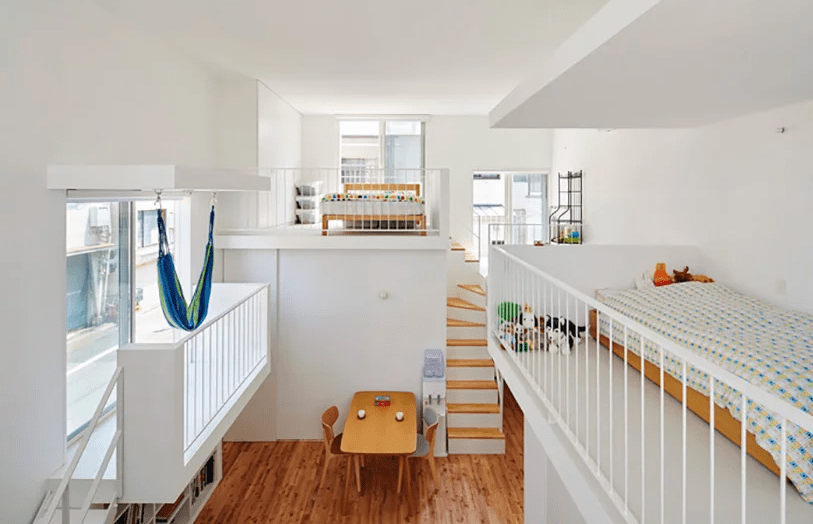
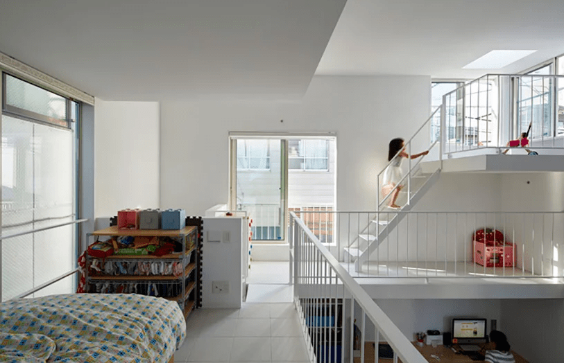
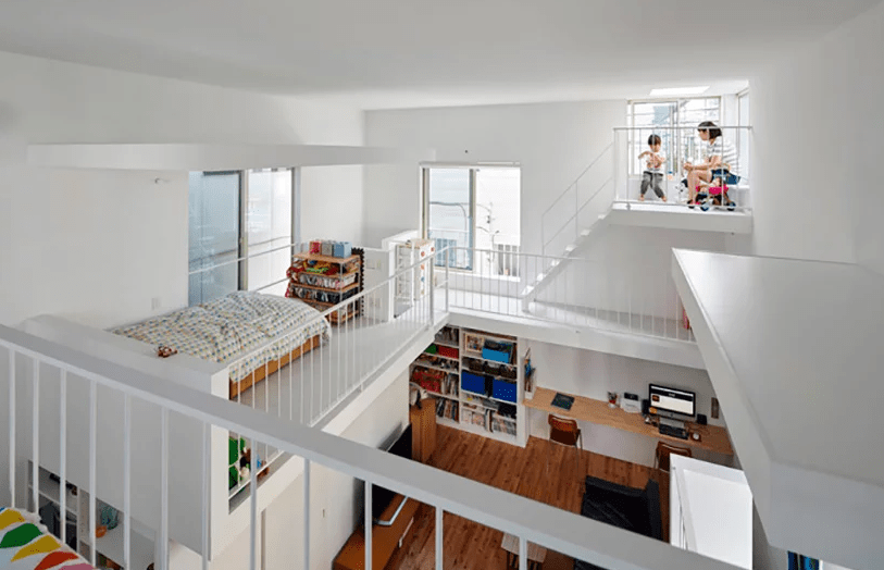
Takeshi Hosaka Architects has built a house for a couple and their child in downtown Tokyo where windows’ balconies are reversed and extruded towards its interior. The large and small platforms create a feeling of being outside, bringing life into the 73 sqm space and splitting activities in several levels, which is a trendy and popular idea in modern Japanese architecture.
Located in Taito-Ku, in the northeastern part of Tokyo, the house is enclosed by whitewashed walls, punctuated by windows in different sizes. Takeshi Hosaka Architects has drawn from houses of the surrounding area, where balconies are used as a communication tool amongst neighbors, inverting these platforms to create clusters of social activity within the compact interior.
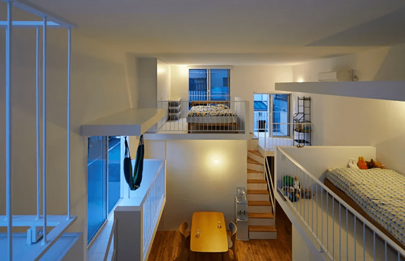
Placed within close distance to each other, the balconies facilitate different functions: the couple’s bedroom and clothes storage, the child’s space, the guest balcony, and the dressing and makeup area. Additionally, a small space on the highest level with access to the roof terrace acts as a mini balcony where children can gather and play, another small area with a hammock for reading and sleeping, and a cloth drying balcony on the south side where laundry can be hung out to dry. Thanks to the balconies location the storage here doesn’t look bulky at all, all the spaces are really airy and ethereal. Inner balconies are the most creative idea of splitting the house into levels and sublevels that I’ve ever seen, and what a great feeling of outdoors while being indoors!
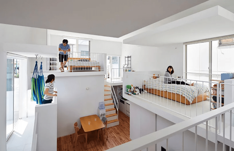
Each balcony contains a sleeping space for a member of the family or members and makes the whole home an interactive space.
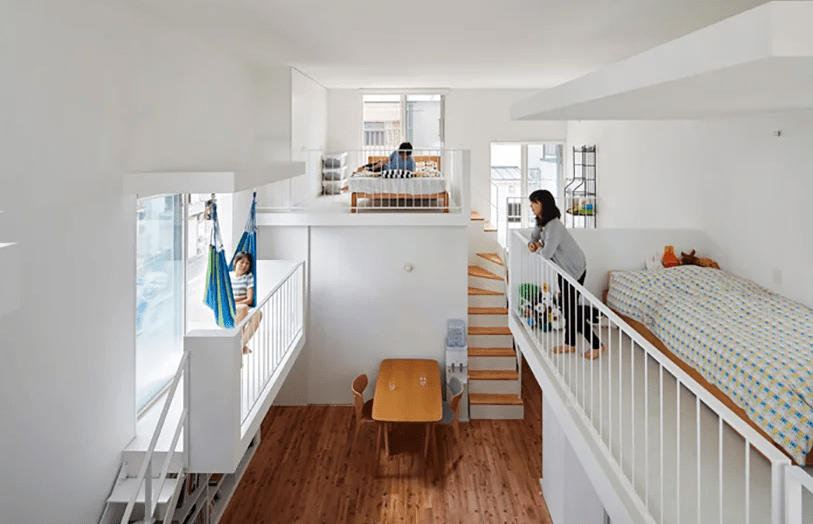
One balcony features a hammock and the main advantage of such a layout is that each space receives much natural light from the windows.
