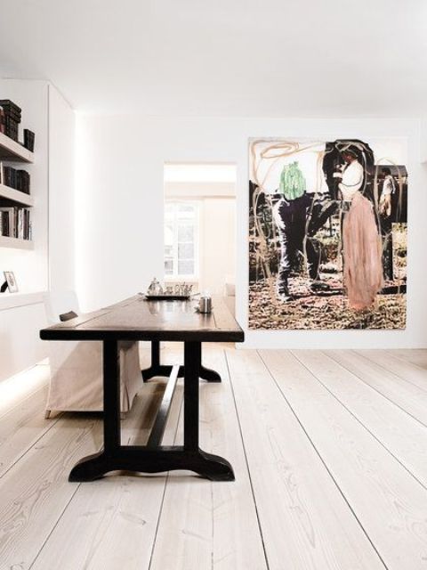
25 Decor Features You Need For An Edgy Space

decor features you need for an edgy space

If you consider decorating and redecorating your home, you should keep in mind some fresh trends and ideas that modern designers offer. We’ve already shared some ideas of edgy furniture that every home needs and today I’d like to show you some more options considering home decor.

Asymmetry

Though symmetry is considered the best idea to visually make your space larger, it also makes your space more ordinary. Asymmetry adds visual interest to the space and it makes it look more casual and less formal. Asymmetrical elements in the decor catch an eye and give your home a character. These can be gallery walls, asymmetrically placed furniture, asymmetrical fireplaces and various accessories, the windows can be also asymmetrical – such an architectural feature is a bold and cool idea if you can go for it.
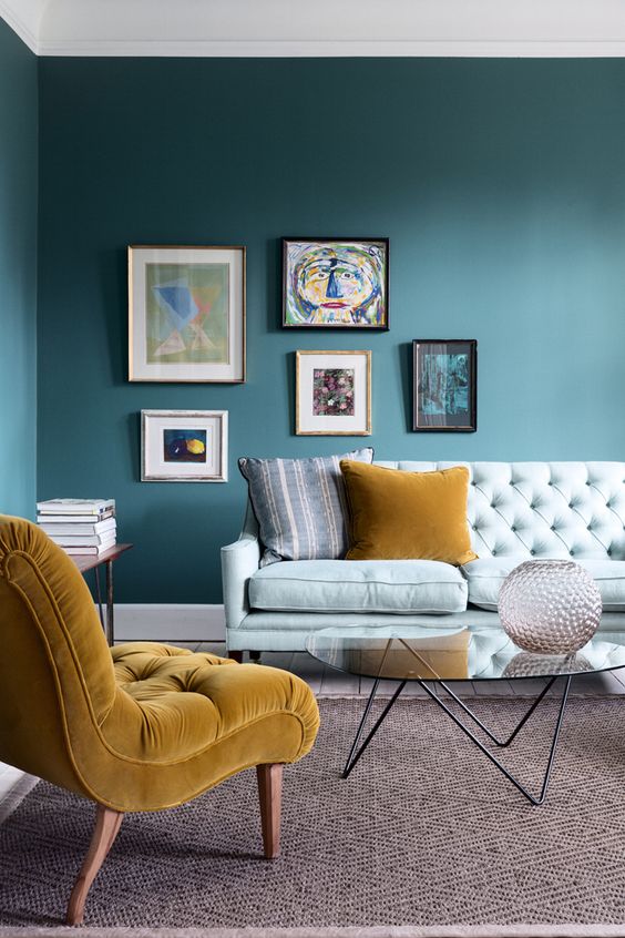
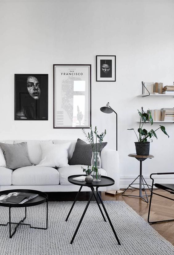
This bold living room features an asymmetrical gallery wall and a chair in front of a sofa.
This bold living room features an asymmetrical gallery wall and a chair in front of a sofa.

Placing chairs and a sofa in a living room asymmetrically is what you need for a catchy look.

Placing chairs and a sofa in a living room asymmetrically is what you need for a catchy look.

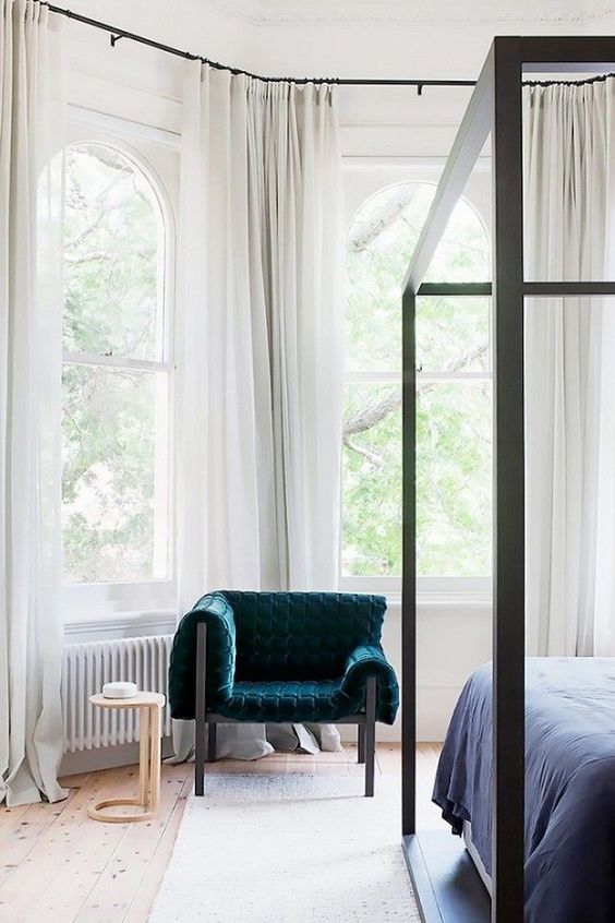
Put just one bold chair in the neutral bedroom and it'll be a bright statement.

Put just one bold chair in the neutral bedroom and it'll be a bright statement.

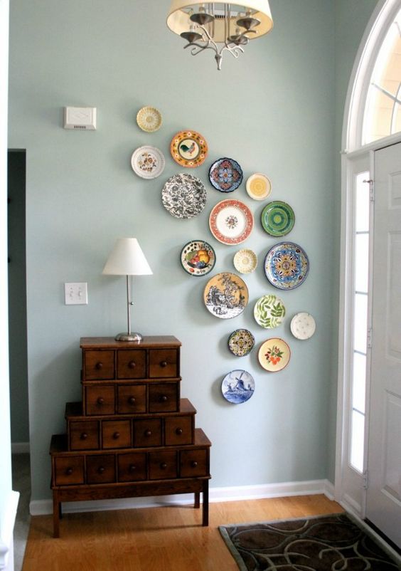
A colorful asymmetrical plate wall is a fantastic and bold idea of decor, which is easy to recreate.
A colorful asymmetrical plate wall is a fantastic and bold idea of decor, which is easy to recreate.

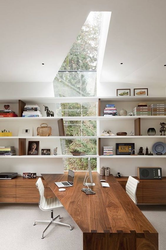
An asymmetrical window going up into the skylight and an echoing desk create a unique character.

An asymmetrical window going up into the skylight and an echoing desk create a unique character.

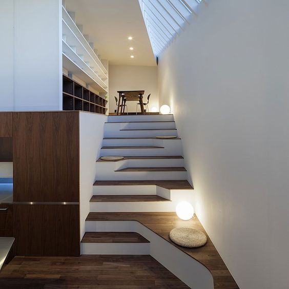
An asymmetrical staircase becomes a cool decor feature, and little cushions here and there make sitting spots.
An asymmetrical staircase becomes a cool decor feature, and little cushions here and there make sitting spots.

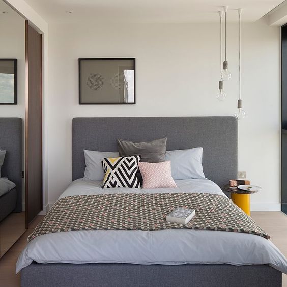
Pendants and a nightstand on one side and an artwork on the other show off the character of the space saving it at the same time.
Pendants and a nightstand on one side and an artwork on the other show off the character of the space saving it at the same time.

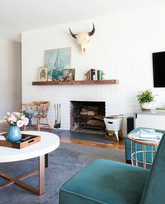
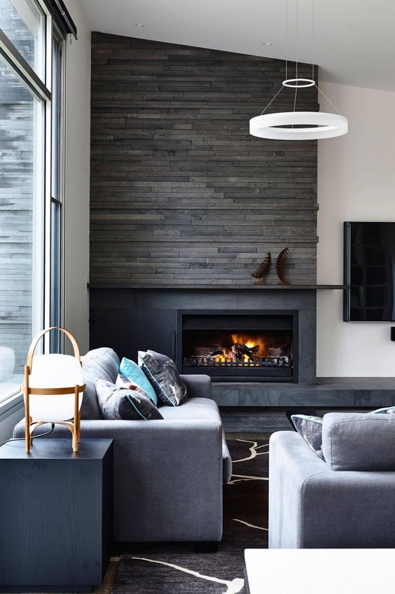
An asymmetrically attached mantel accents the fireplace and the objects on the mantel and above it.

An asymmetrically attached mantel accents the fireplace and the objects on the mantel and above it.

Black framed asymmetrical gallery wall is highlighted with black legged furniture and surfaces.

Black framed asymmetrical gallery wall is highlighted with black legged furniture and surfaces.

A fireplace built in asymmetrically looks more interesting and there can be a sitting place on the left.

A fireplace built in asymmetrically looks more interesting and there can be a sitting place on the left.

Mixed Metallic Finishes

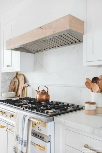
Matching metallics has always been a hard problem, which required tons of time to look for the pieces that match but now you can forget about it – no more matching! Mixed metallic finishes have become a trend, and you may see more and more spaces with them. Of course, there is a couple of rules that you should apply to achieve a stylish look but that’s not difficult! Choose a dominant metal that will the main one, then match the finishes – they should be the same to unify the look and highlight the statement piece, which is done in the dominant metal.
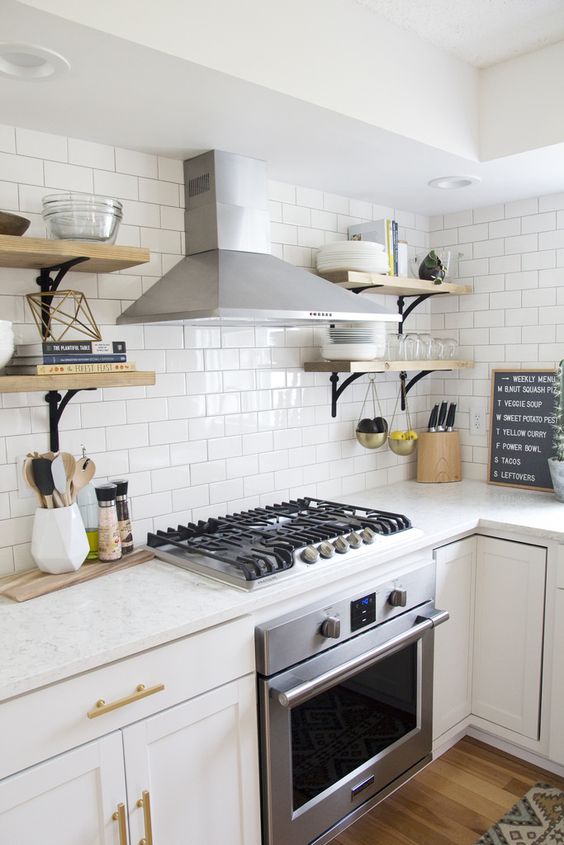
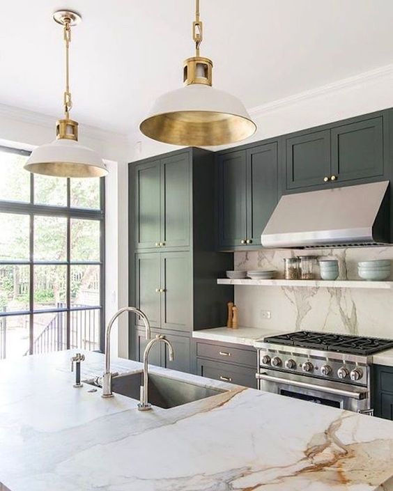
Stainless steel of the appliances is the main here, and shiny gold adds to the space.

Stainless steel of the appliances is the main here, and shiny gold adds to the space.

Satin finish here makes brass and darkened metal look unified.

Satin finish here makes brass and darkened metal look unified.

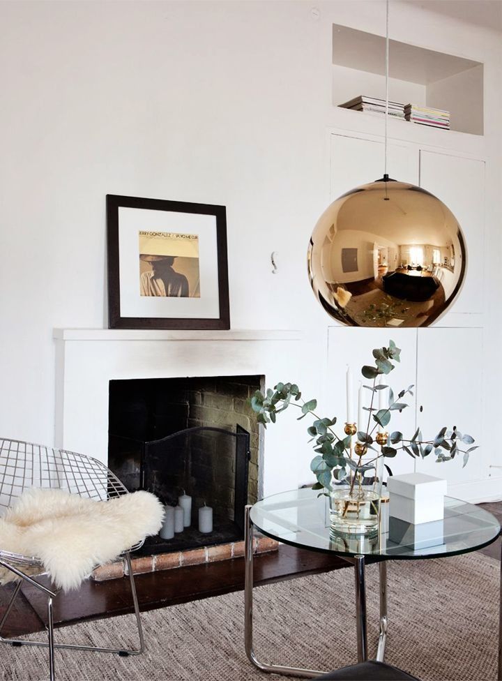
A shiny oversized copper lamp is the dominant piece here, and stainless steel is added.

A shiny oversized copper lamp is the dominant piece here, and stainless steel is added.

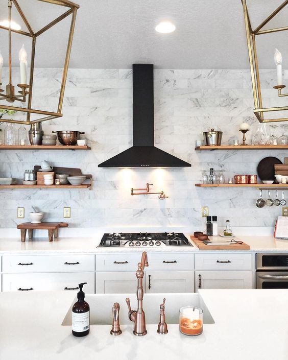
Copper and brass with a satin finish add a vintage and refined feel to the space.

Copper and brass with a satin finish add a vintage and refined feel to the space.

Though satin stainless steel dominates here cause of appliances, brass adds a warm touch to the kitchen.
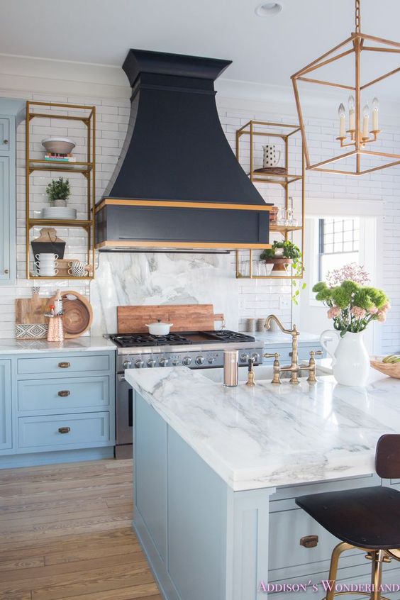
Though satin stainless steel dominates here cause of appliances, brass adds a warm touch to the kitchen.

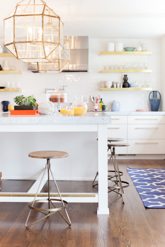
Bright gold touches dominate over the space but you may also see some stainless steel and copper.

Bright gold touches dominate over the space but you may also see some stainless steel and copper.

Brass touches with a satin finish are amazing for a retro feel in the kitchen decor, and stainless steel is the secondary metal.

Brass touches with a satin finish are amazing for a retro feel in the kitchen decor, and stainless steel is the secondary metal.

Negative space

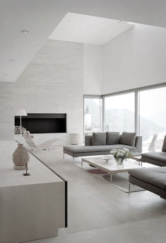
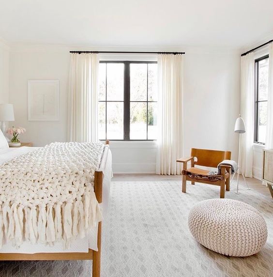
A negative space is one more idea, it’s not even a trend, it’s a timeless idea that always works. It’s a spot where there’s nothing, which is psychologically pleasing, and such a feel of a spacious room is always great. Besides, you may use this spot anytime filling it with something. A negative space in any room should be intended to look harmonious. To have enough room for a negative space, declutter the space and use double-duty furniture. Negative space accentuates the decor you have even more creating that light feeling of a large room.
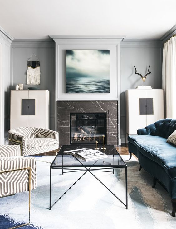
A minimal space done with much negative space and filled with light for an airy feeling.

A minimal space done with much negative space and filled with light for an airy feeling.

A cozy rustic-inspired interior with blank space for a comfortable feel.

A cozy rustic-inspired interior with blank space for a comfortable feel.

Negative space makes the bathroom more welcoming and the dark wood doesn't dominate over the space.

Negative space makes the bathroom more welcoming and the dark wood doesn't dominate over the space.

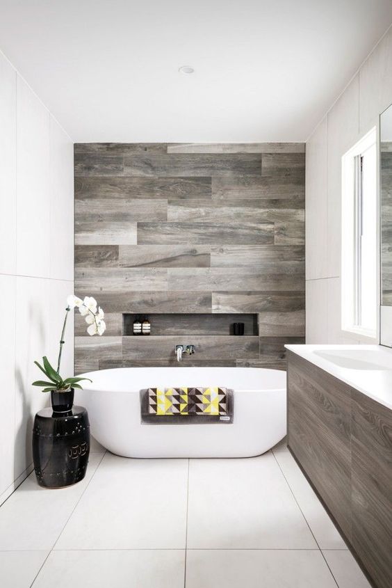
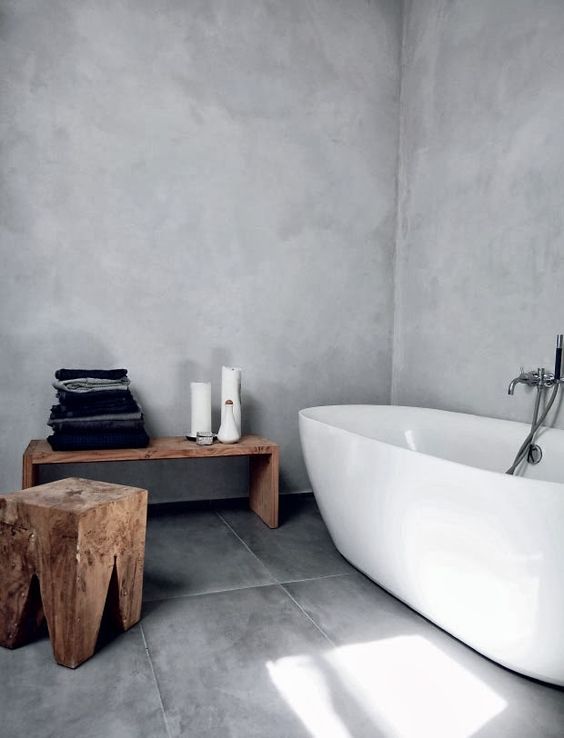
Minimalist rooms really need some negative space, declutter your bathroom to have some.

Minimalist rooms really need some negative space, declutter your bathroom to have some.

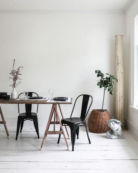
A dining space is fully uncluttered and features much negative space for a peaceful feel.

A dining space is fully uncluttered and features much negative space for a peaceful feel.

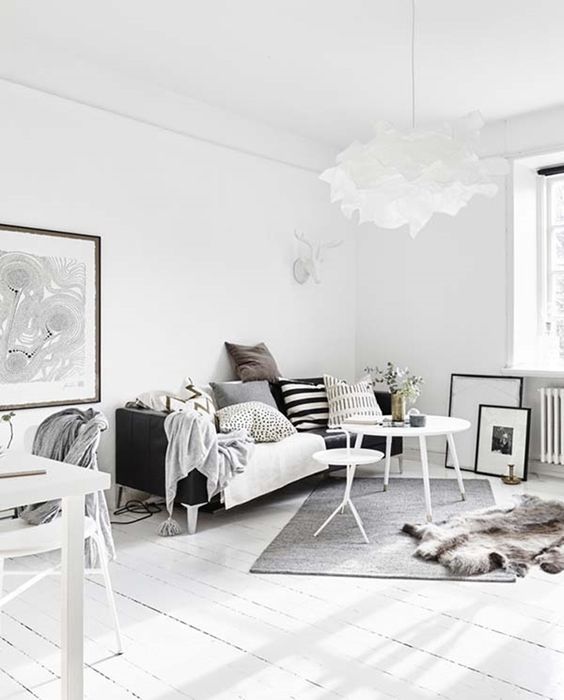
A Scandinavian room with enough negative space looks very airy and light-filled.

A Scandinavian room with enough negative space looks very airy and light-filled.

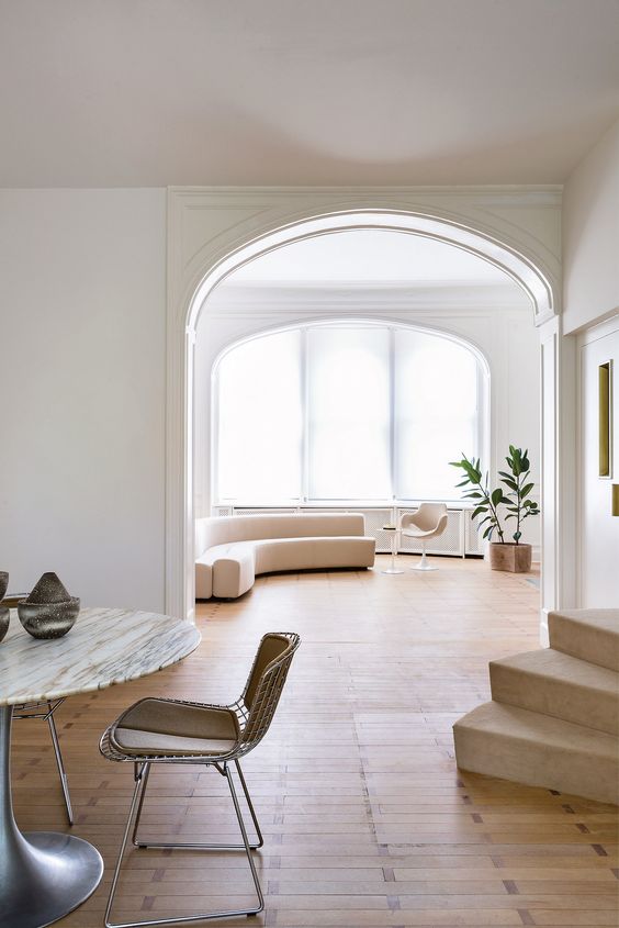
A modern light-colored space with much negative space looks very spacious and welcoming.

A modern light-colored space with much negative space looks very spacious and welcoming.

Accent your decor much more using negative space, it's gonna stand out.

Accent your decor much more using negative space, it's gonna stand out.