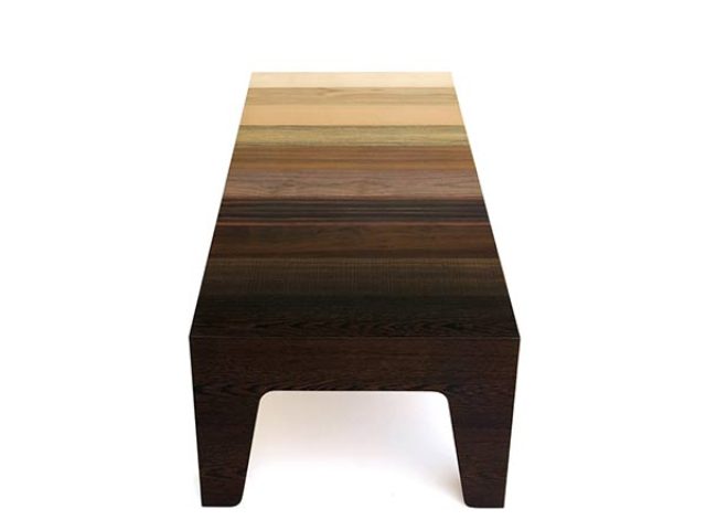
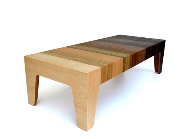
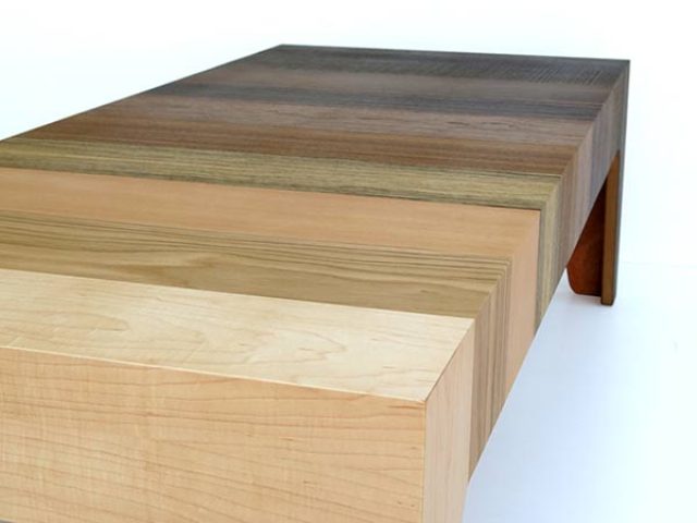
You know that aesthetics is not only in lines or curves, the textures can also be attractive. While the Gradient Table’s silhouette might be somewhat basic, its use of materials and resulting aesthetic are anything but! The design is comprised of ten different types of wood veneer laid out from brightest to darkest, creating a unique gradient pattern. Using various types of veneer brings out the color, Eli Chissick used textures while celebrating the natural beauty of wood. It’s perfect for bringing weight and visual focus to one side of a room while lightening the other, and your kitchen will be complimented with it!


