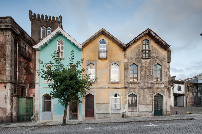
Located in Braga, Portugal, a historic building ‘The Three Cusps Chalet’ has been renovated to serve as an annex for a small neighboring palace. The distinctive building analyzes its context and combines typical 19th century Portuguese architecture and urban design with an unexpected Alpine influence.
The project was overhauled by Tiago do Vale Architects and their goal was the clarify the scheme’s spaces and reintegrate a sense of scale, detail and its original image. The building’s character inside and outside had been lost due to the different interventions and change in programs over the span of 120 years.
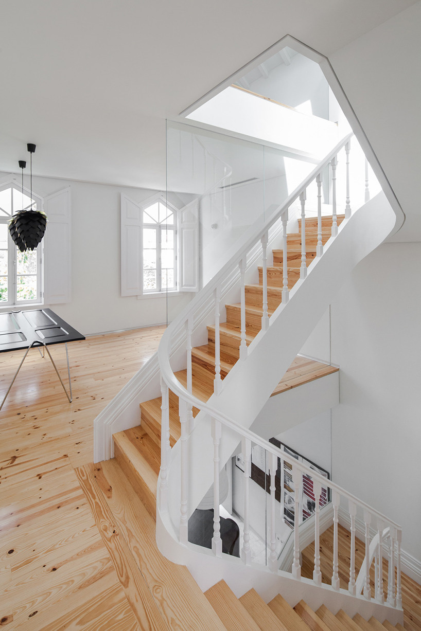
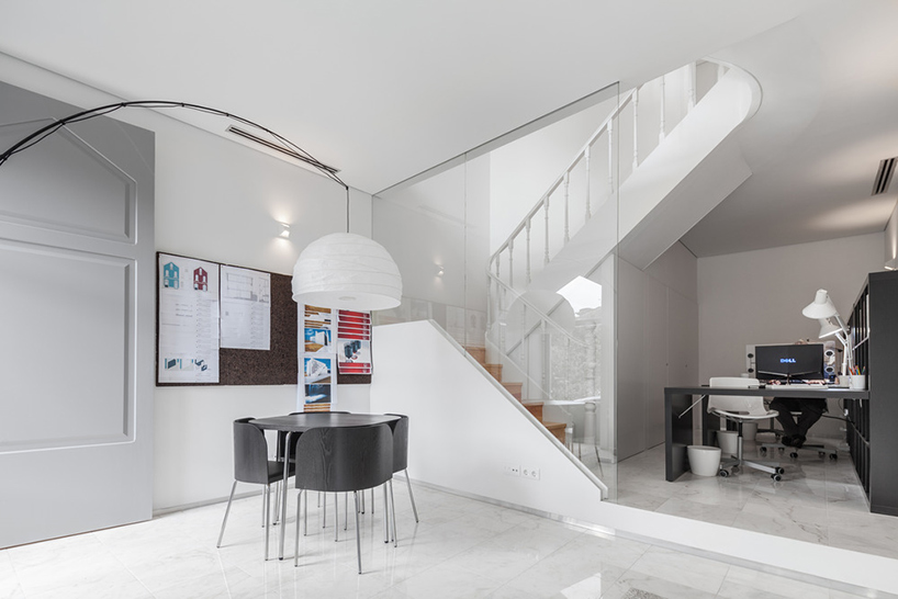
Firstly, the façade was restored to its original glory, reinstating the original wooden window frames and preserving the colorful decorated eave. Secondly, the interior was recuperated and refurbished to include refined finishes such as timber floors, new ceiling structures and Portuguese marble. Spread across three storeys, the scheme hosts rooms for living and working simultaneously. The interiors got a modern look but with a hint on the historic past: some vintage-inspired details and touches are kept in the contemporary spaces.
The strategy in which the architects took was to order spaces by hierarchy spaces by the floor which it was on; the sleeping quarters located at the top. The stairs are narrower with each flight of steps, informing the changing nature of the spaces it connects. In addition, the staircase geometry efficiently filters the visual relations between both programs while still allowing for natural light to seep down from the upper levels. The designer also used the attic space for placing there a closet, it’s a smart and comfy solution, which keeps the space modern.
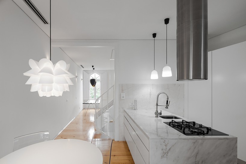
White color is methodically repeated on walls, ceilings, carpentry and marble to make the interiors modern and spacious.
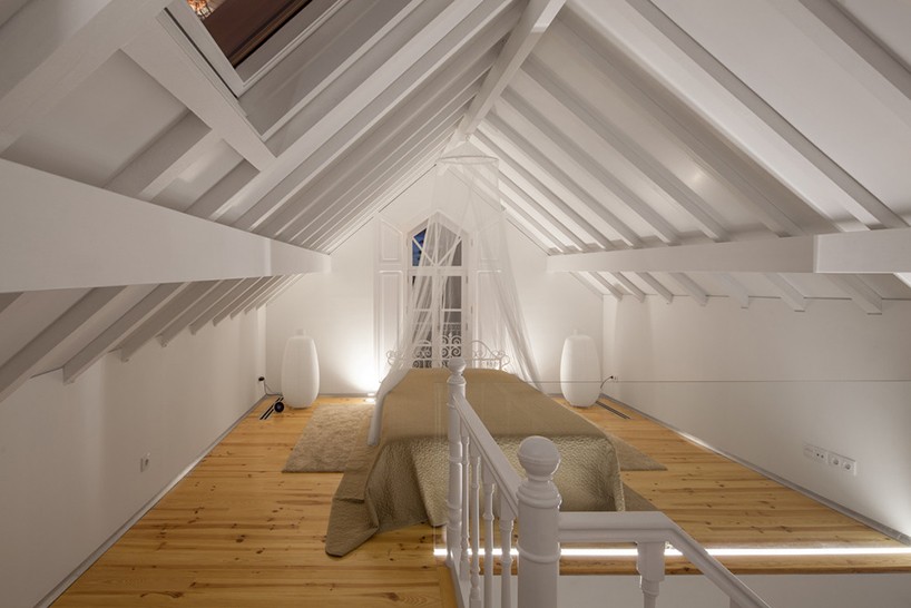
The master bedroom reminds of vintage decor with its vignette headboard and a canopy but looks modern also.
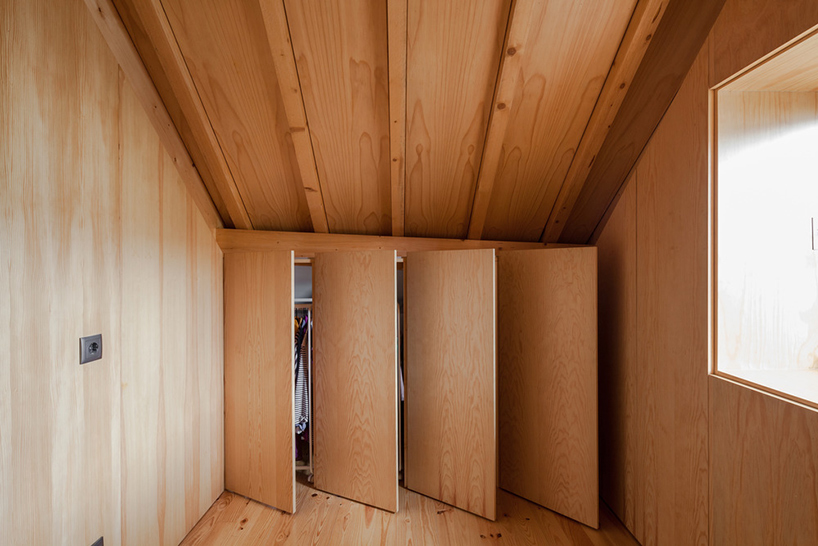
This smart closet solution was installed in a small attic space, which is very useful and practical idea.
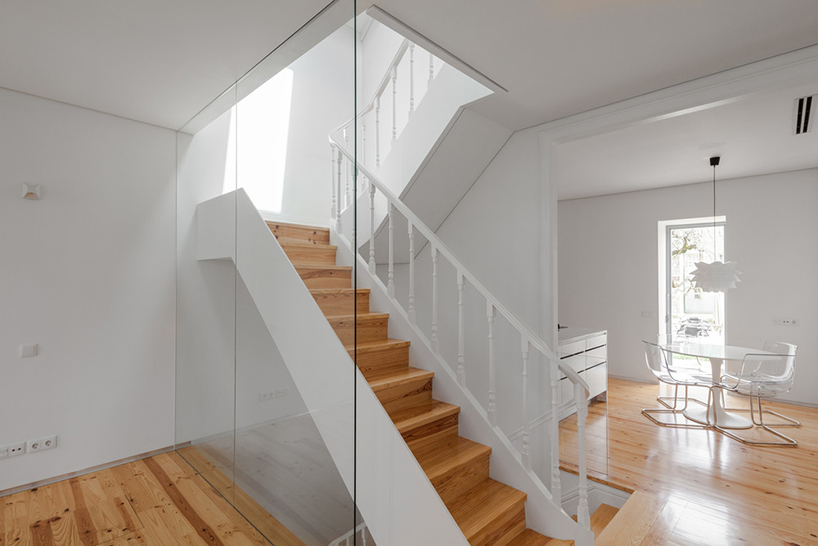
The interior went back to its spacial and functional layout, wooden floors and ceiling structures and the staircase.
