This mid-century modern home is clearly Scandinavian at the same time, take a look at this harmonious combo.
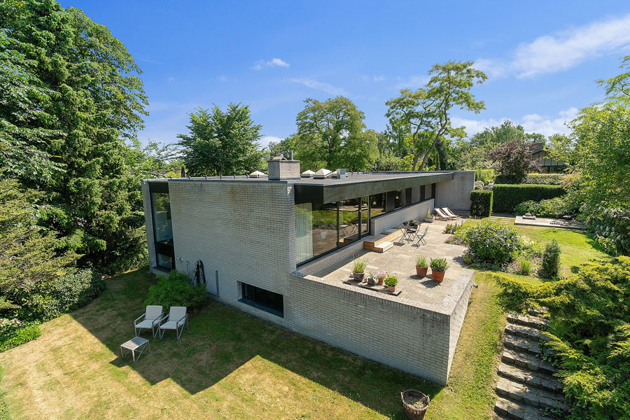
This Danish home was built in 1968 and was designed by architect Knud Holscher. It features a clear combo of mid-century modern style with a Scandinavian feel. The original materials here give a visual history and connect you to the mid-century modern architecture. Let’s take a closer look at each space.
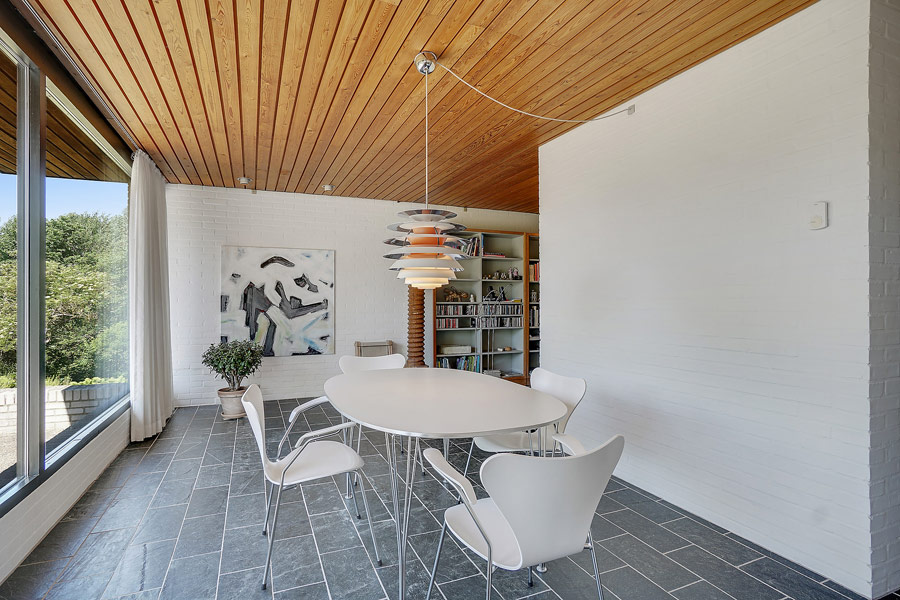
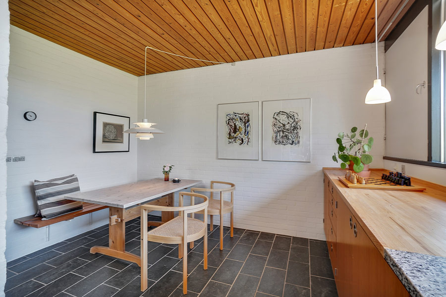
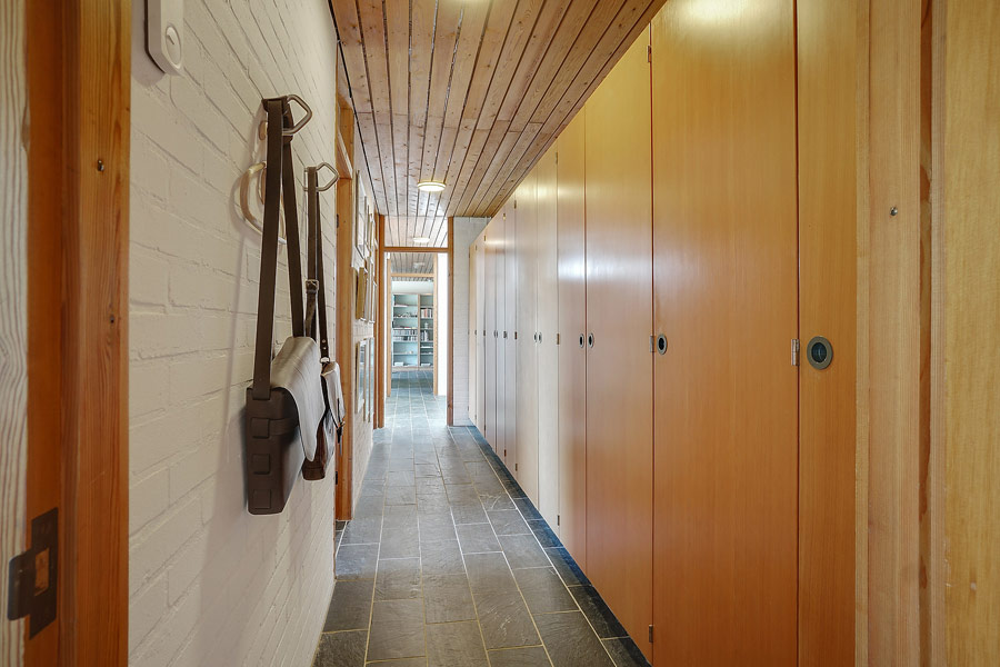
The interiors are done with white brick walls, dark tile floors and light-colored wooden ceilings everywhere, which make a cool backdrop for filling; the use of wood and brick is rather mid-century like but the light shades hint on Scandinavian style. The fact that all the spaces are very light-filled due to many windows is also very Nordic-like and adds personality to the house.
The airy and light-filled living room is done with dark furniture, whitewashed bookcases and a fireplace wall, which is also clad with whitewashed brick. The fireplace wall separates the dining space from the living room slightly and gently. The dining room features a view as it’s placed next to the window. The long kitchen features light-colored wooden cabinets, a cool view and a breakfast nook, which is separated from the kitchen itself with a part wall. The master bedroom is a peaceful space, there’s a comfy bed, masks on the wall, a wardrobe and a catchy and bright dresser with a mirror.
The house also features a large terrace with loungers, a small dining zone and potted greenery. The terrace seamlessly flows into an outdoor zone with a cool lawn and a lot of plants. Get inspired and steal some ideas for your home!

The living room is done with dark sititng furniture and light-colored tables and bookcases, a fireplace adds coziness.
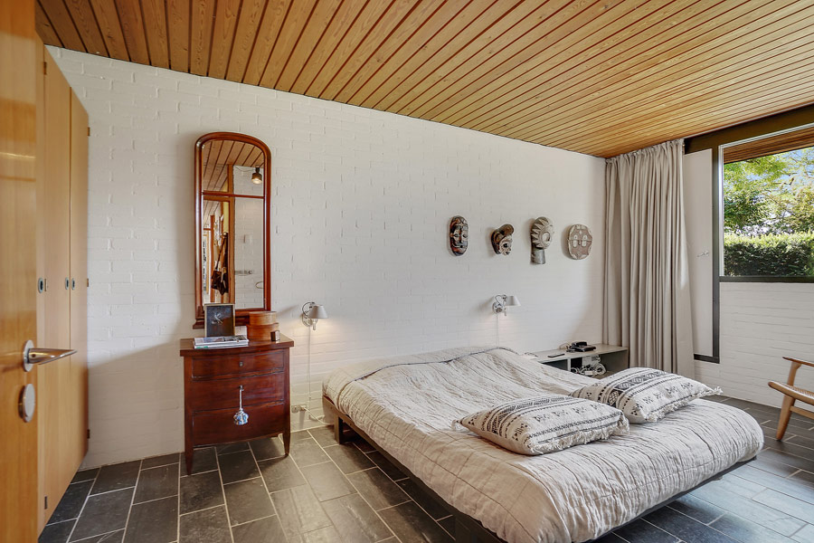
The master bedroom is done with a large bed, wardrobes, a dresser of redwood and somemasks on the wall.
