Minimalist Bachelor’s Pad In Moody Colors

This minimalist bachelor's pad was designed using moody colors and warm woods

This minimalist bachelor's pad was designed using moody colors and warm woods.

Igor Sirotov, of Sirotov Architects, designed this 76-square-meter apartment in Kiev for a young man wanting a modern space. Focusing on dark, moody colors and warm woods, the interior has a classy and sophisticated look while remaining comfortable and inviting.

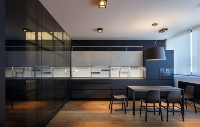
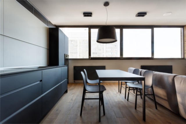
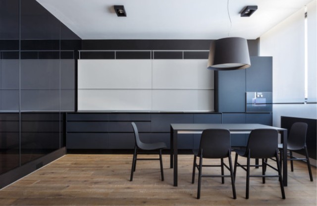
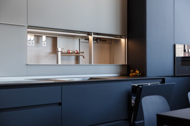
The sleek kitchen hides away the details leaving you to wonder where everything is, including the kitchen faucet. Once the sliding doors are moved, you can see everything perfectly tucked away until needed. The smooth, dark cabinets match the dining table and chairs, which are by Kristalia.

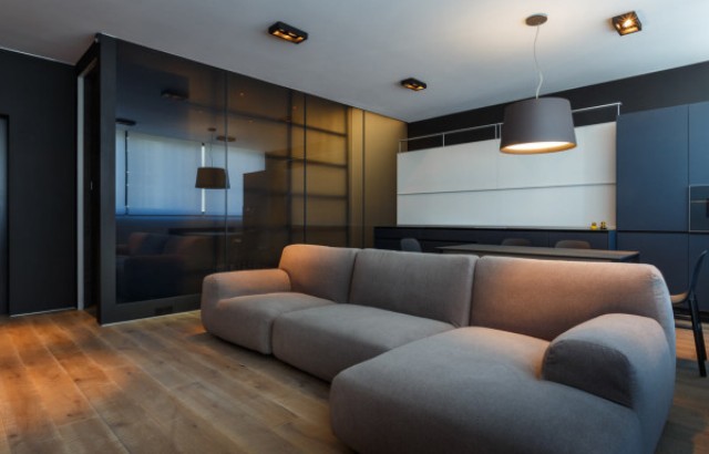
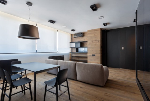
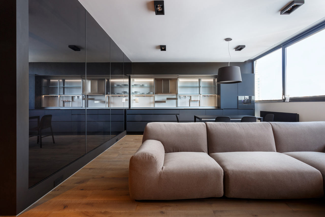
The living room area is clad with warm wood to make it cozier. The plush, L-shaped sofa in a neutral color is by Paola Lenti. I love the minimal dark ceiling light, which perfectly highlights the home décor.

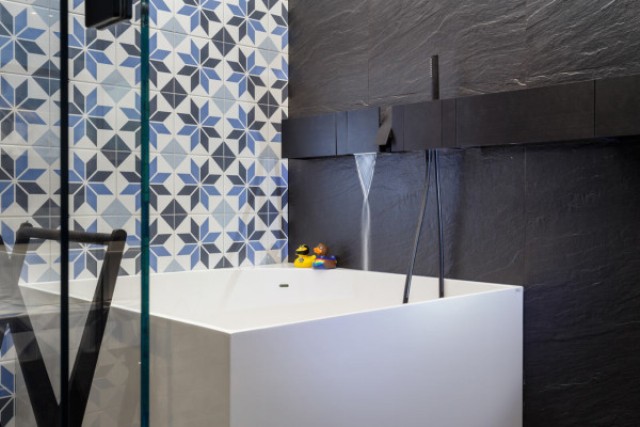
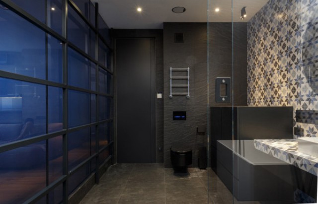
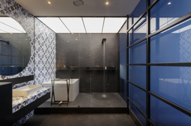
Behind the smoky blue glass wall is the bathroom that features one entire wall covered in Aparici Vanguard System tiles, which have a vintage look. The shower fixtures match the color of the dark tiles behind it, which continue onto the floor of the bathroom. There’s also a square bathtub, which reminds once again that it’s a man’s space.

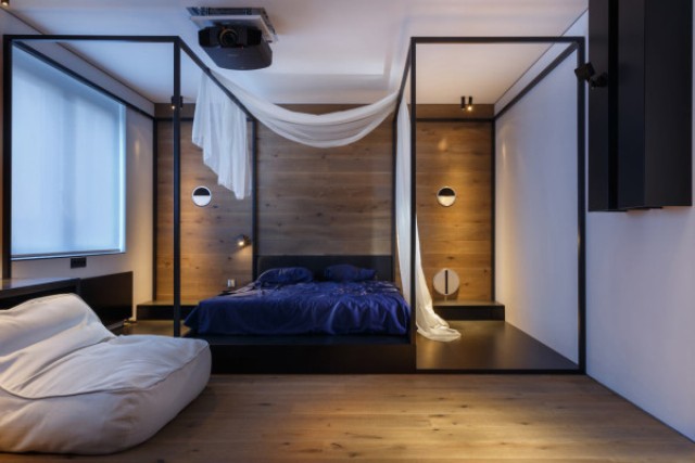
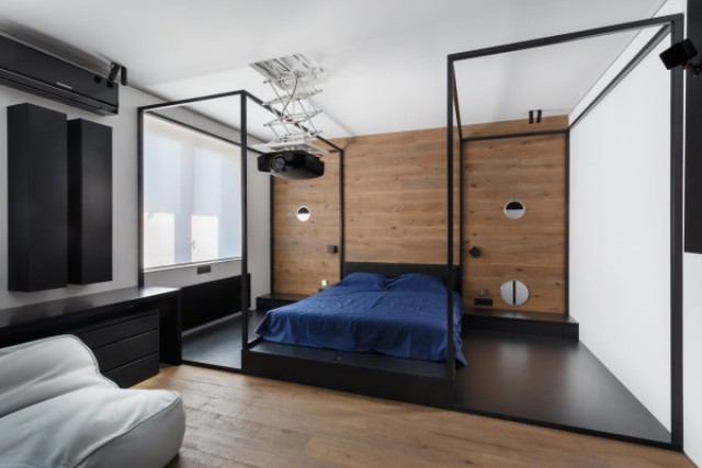
The bedroom features a wooden wall behind the bed and two metal structures that are almost like opposite canopies. A projector pulls down from the ceiling for movie watching.

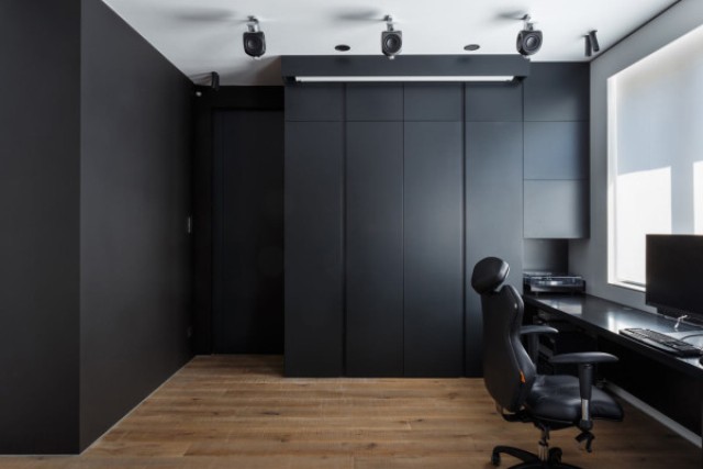
The home office is clad with black panels and again everything is kept perfectly uncluttered and sleek, what a gorgeous apartment for a young bachelor!
2 of 13
The sleek kitchen is uncluttered and minimalist, here you'll have to guess where everything is.

The sleek kitchen is uncluttered and minimalist, here you'll have to guess where everything is.

3 of 13
Warm woods and brown shades make the apartment more inviting and cozy, and the windows are big enough to let a lot of light in.
Warm woods and brown shades make the apartment more inviting and cozy, and the windows are big enough to let a lot of light in.

4 of 13
Once the sliding doors are moved, you can see everything perfectly tucked away until needed.

Once the sliding doors are moved, you can see everything perfectly tucked away until needed.

5 of 13
The smooth, dark cabinets match the dining table and chairs.

The smooth, dark cabinets match the dining table and chairs.

6 of 13
The plush, L-shaped sofa in a neutral color is by Paola Lenti.

The plush, L-shaped sofa in a neutral color is by Paola Lenti.

7 of 13
The living room area is almost fully clad with warm woods to make it cozier.

The living room area is almost fully clad with warm woods to make it cozier.

8 of 13
The shower fixtures match the color of the dark tiles behind it, which continue onto the floor of the bathroom.
The shower fixtures match the color of the dark tiles behind it, which continue onto the floor of the bathroom.
9 of 13
The bathtub is square to remind that it's a man's space.

The bathtub is square to remind that it's a man's space.

10 of 13
The touches of industrial style look very chic here.

The touches of industrial style look very chic here.

11 of 13
The bedroom features a wooden wall behind the bed and two metal structures that are almost like opposite canopies.

The bedroom features a wooden wall behind the bed and two metal structures that are almost like opposite canopies.

12 of 13
A projector pulls down from the ceiling for movie watching.

A projector pulls down from the ceiling for movie watching.

13 of 13
The home office is clad with dark panels, which hide everything until the owner needs it.

The home office is clad with dark panels, which hide everything until the owner needs it.

Source: design-milk