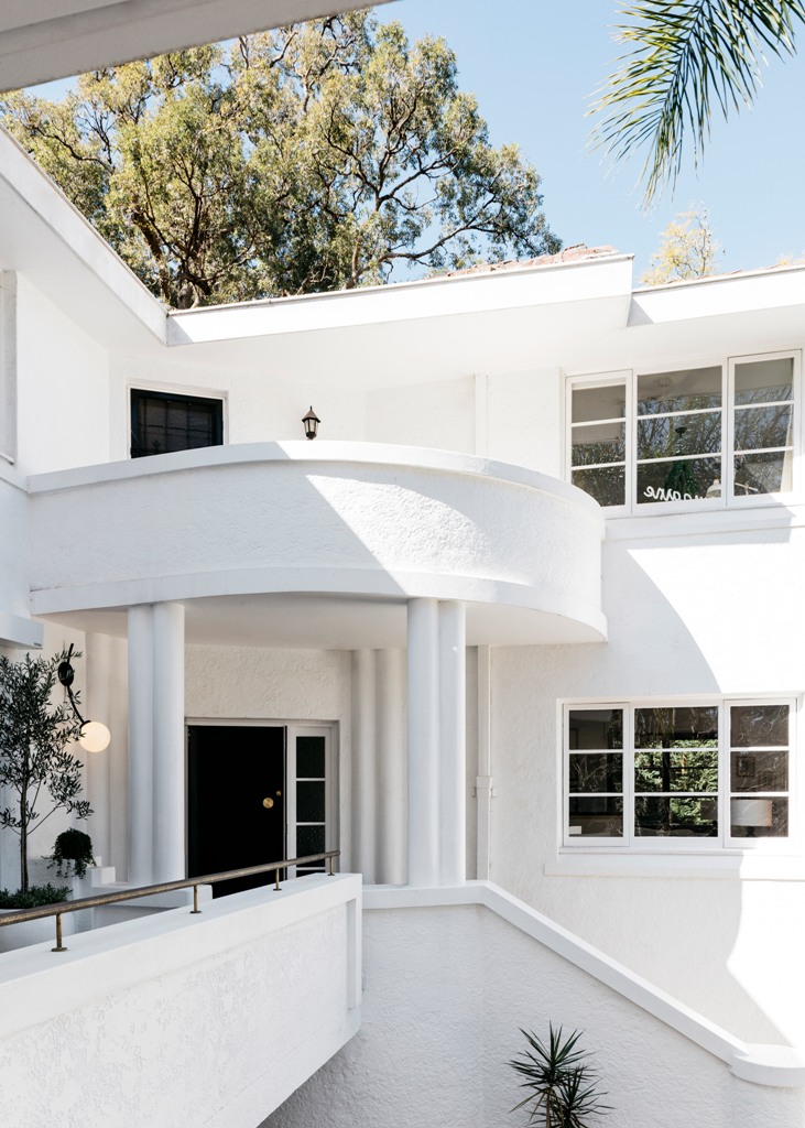
This gorgeous home was built in 1930s and its facades are inspired by luxurious ships that were on at that time, the outside was kept and restored, the inside was renovated.
Curatorial House, situated in the city’s North Shore area, was built in the 1930 and then redesigned by Australian studio Arent & Pyke to let the owner’s extensive art collection take center stage.
The original house is characterised by white-painted and curved facades intended to emulate the appearance of luxury ships that were popular during the period when the house was built. The architects kept the original structure and redesigned the inside to make it more modern. The new design respectfully nods to the glamour of the era and avant-garde nature of the P&O movement, which was on in 1930s.
The studio began by applying a monochromatic scheme throughout the home to visually unify its living spaces, completing walls in white and timber floorboards in starkly contrasting black. The designers also hoped the restrained palette would allow the artworks and furnishings to speak volumes.
The kitchen, which had previously been sat at the rear of the home with little access to natural light, has been moved to the centre of the ground floor to serve as the main family gathering point. It now features a marble-topped breakfast island, pale cabinetry and a full height display unit for crockery.
The designers then decided to introduce a fireplace to the home’s living area to make it feel more warm and welcoming. A balcony has also been constructed at the front of this room to create a better visual connection towards the property’s sizeable garden and outdoor pool. Get inspired by all the spaces of this amazing home and extension below!
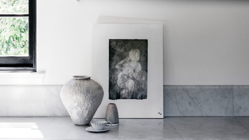
The designers added a modern feel to the inside spaces with a nod to the glam of 1930s and displayed the artwork collection at its best.
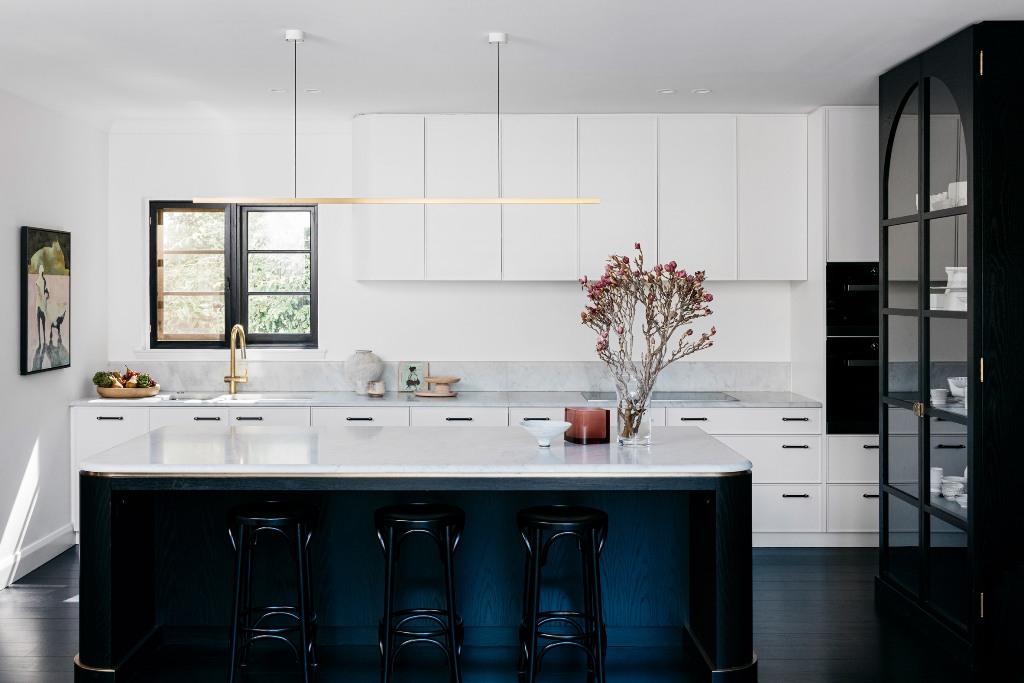
The kitchen features amazing white cabinets and surfaces spruced up with gilded touches and given depth with black details.
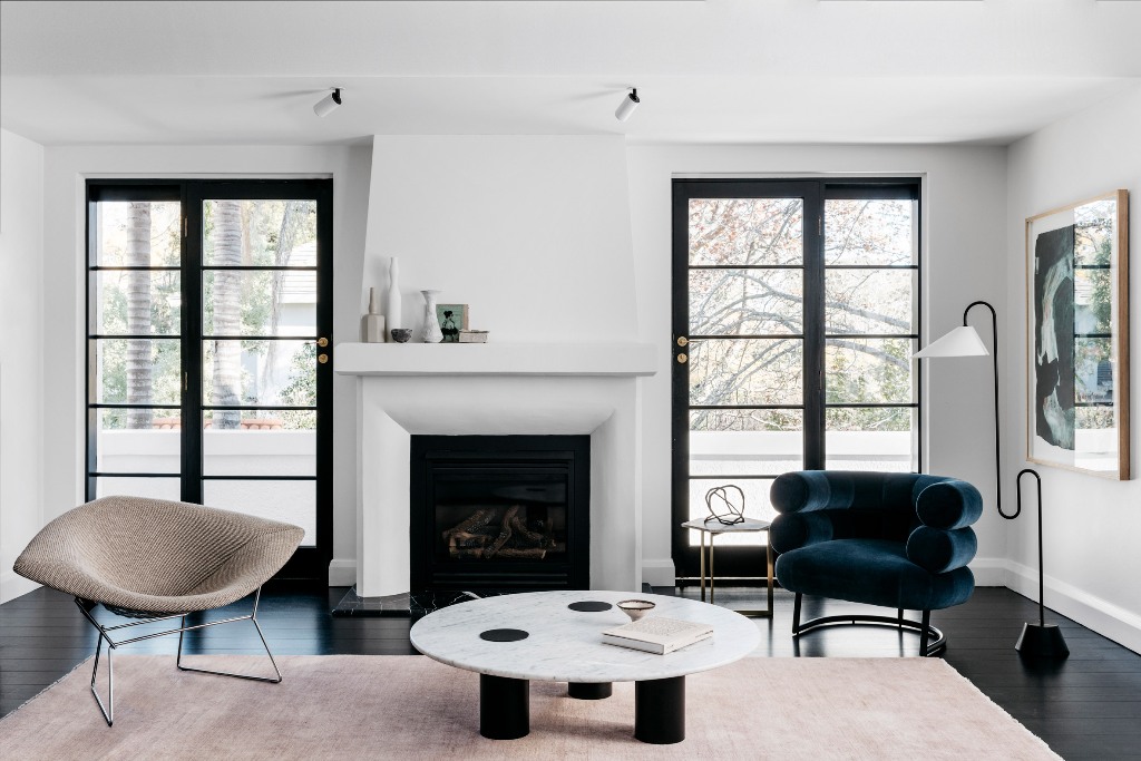
The impeccable taste, with which the furniture was chosen, just strikes, and look at that fireplace, that was newly built - isn't it perfect stylized.
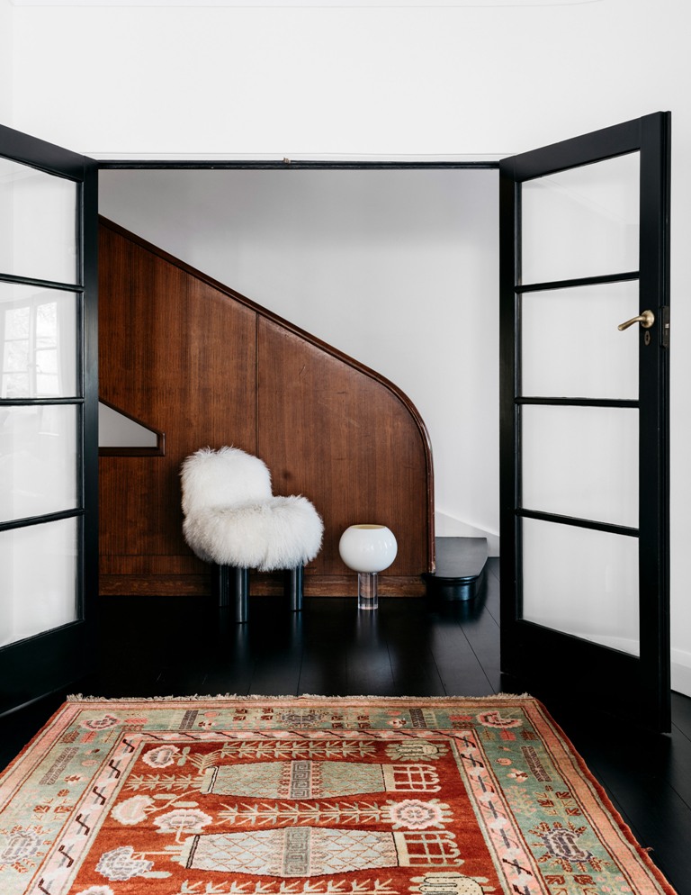
The monochrome color scheme was integrated into the decor to keep it in perfect harmony with the facades of the house.
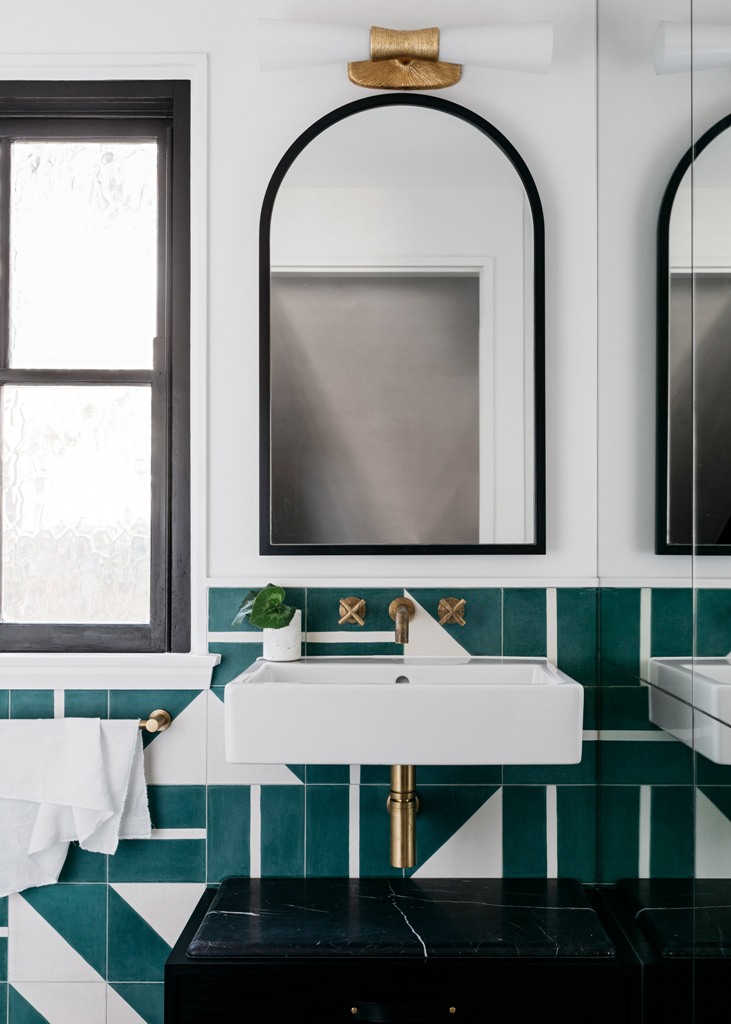
The bathroom is done with amazing green geometric tiles, black marble touches and brass fixtures.