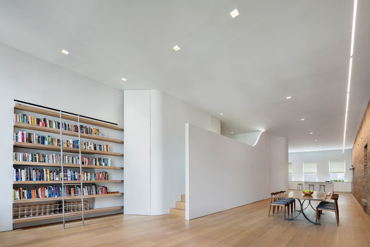
This contemporary New York loft was opened and decorated, and a sleeping space was built in creatively.
Lofts are traditionally open space, and when it came to designing this New York City one, Julian King Architect got creative to incorporate a sleeping space and keep it open. Wanna see how? Let’s take a look!
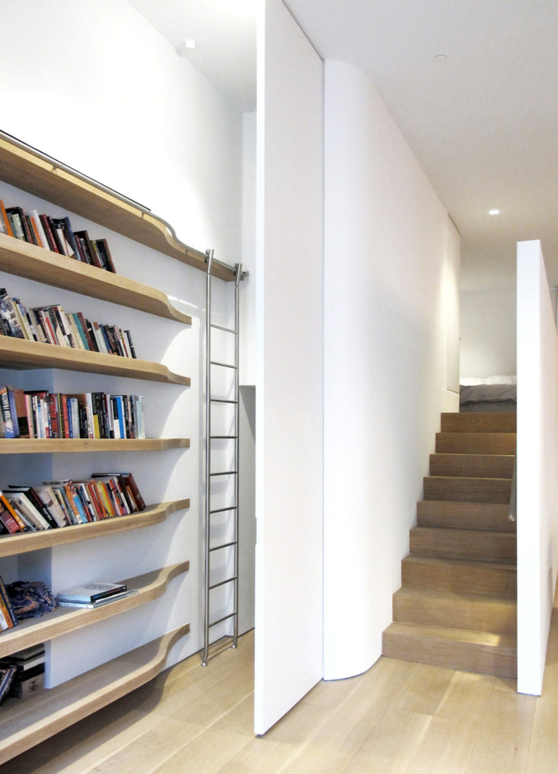
This long and narrow loft is located in a 1872 warehouse building that was opened up and then a slender mezzanine on one of the long walls was created. Typically, the bedrooms would be placed at the ends of loft by the windows but this solution is a very creative and cool idea: the bedroom gets a private area while the loft remains open and retains the natural light that enters from both sets of windows. A LED light was embedded into the top of the mezzanine wall where it casts a soft glow up on the ceiling. A long, curved wall disguises a staircase that leads to the sleeping area. The wall was cut out to give the bedroom loft the feeling of being open and light filled.
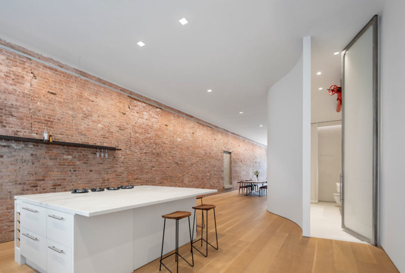
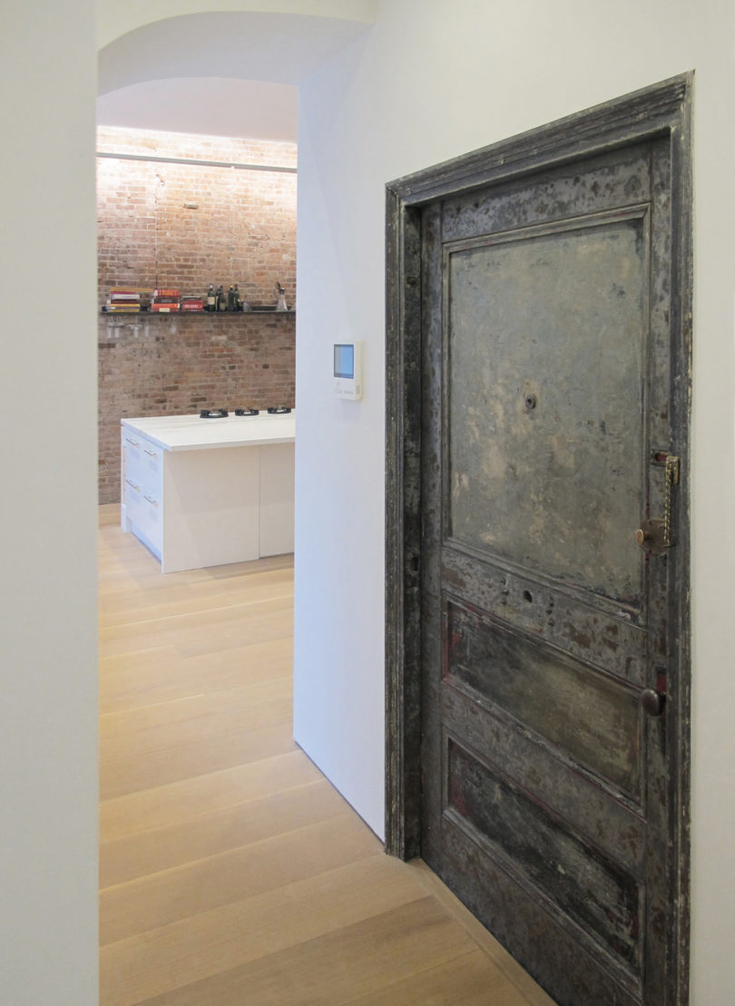
The new kitchen rests along the south facing windows where the homeowners can grown herbs, vegetables, and plants in pots along the windowsill. To keep the kitchen open, a single custom steel shelf hangs on the original brick wall to hold wine glasses and bottles.
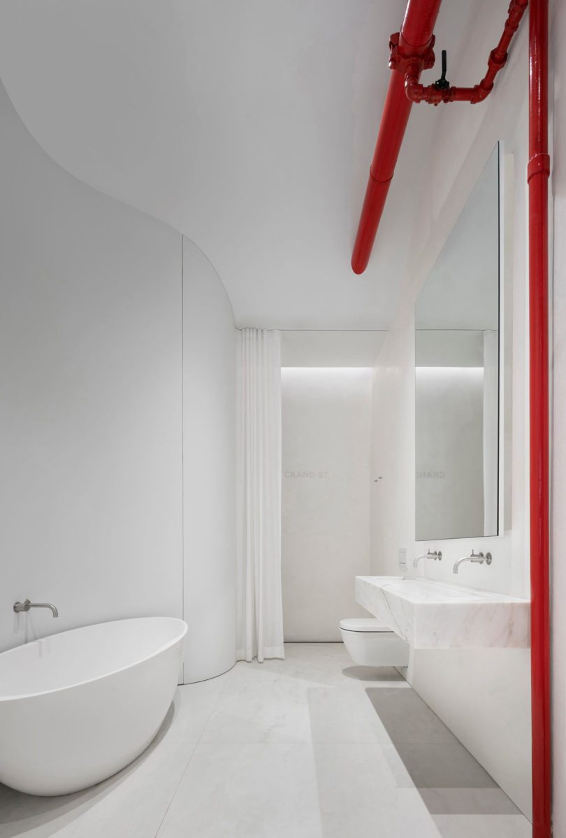
Behind the remainder of the curved wall is the loft’s all-white bathroom. The minimalist space is offset by the bold red pipes. The entryway features just a curved built-in bench of plywood and nothing else.
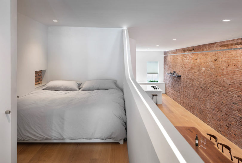
This is a small mezzanine, which is a sleeping space hidden from all the eyes, it's small yet welcoming.
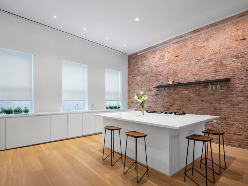
The kitchen is white and long, there are no upper cabinets and a white kitchen island with stools for eating.
